

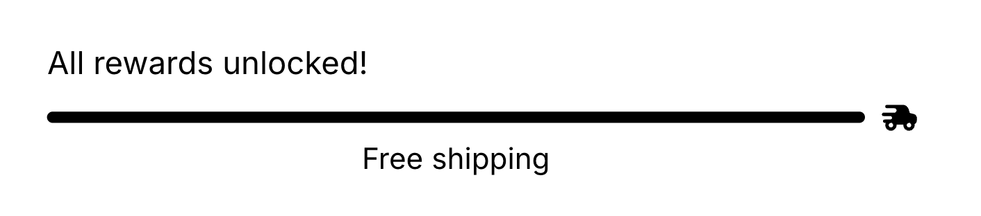
The Rewards block shows a progress bar toward reward tiers (free shipping, an order discount, or a free gift) that shoppers unlock by adding more to their cart, motivating larger carts by showing shoppers how close they are to the next reward and granting qualifying rewards automatically. Tiers can vary by market, country, and currency.
Tier threshold validation
Each condition’s tier list holds up to 4 tiers — a Rewards block with several market, country or currency conditions stores up to 4 per condition, and because the first matching condition is the one shown, any single shopper sees at most 4. Each tier’s threshold must be strictly greater than the tier above it — thresholds must be in ascending order. If a tier’s threshold is equal to or lower than the previous tier’s threshold, an inline error appears on that tier’s threshold field and the Save button is blocked until the issue is resolved. The affected tier automatically expands so the error is visible. For example, if Tier 1 is set to $100, Tier 2 must be set to $101 or higher.Behavior
- Progress excludes reward-gift lines, product add-on lines, shipping-protection lines, and gift cards from the total, so those items don’t inflate the shopper toward a reward.
- The message shows the remaining amount or count to the next tier, or the completed message once all tiers are met.
- Free gifts are granted automatically. When a shopper reaches a gift tier, the gift is added to the cart; if they drop below it, the gift is removed. With stackable rewards off, only the top achieved tier’s gift is granted.
- Add back removed free gifts controls what happens when a shopper manually removes an auto-granted gift. When enabled (the default), the gift is automatically re-added on the next cart update. When disabled, the removal is respected and the gift stays out of the cart for the rest of that session, so shoppers aren’t fighting the cart to decline a gift.
Settings
Each tier expands to:
Placement and limits
- Region: any (top, body, or bottom).
- Maximum: 1 per cart state — the filled cart and the empty cart each get their own.
- State: both filled and empty cart.
- Not added by default. Not locked, so you can remove or hide it.
Per-market rewards
Rewards is the block with the full Conditions UI today: define multiple sets of tiers, each targeting a Shopify market, customer country, or customer currency (In or Not in). The first matching condition is shown to the shopper. If none match, the block renders nothing for them. Each condition is a card in the settings panel (When + condition). Below it, a Display section holds the tiers for that condition. Keep specific rules above an All buyers catch-all. Order is priority, not a combination of every match. You can’t delete the last condition (at least one is always required). Editor preview doesn’t evaluate the live buyer; select a condition in the panel to preview that variant. For how conditions relate to the eye toggle and other blocks, see Show or hide by market, country, or currency.Custom template
Supports a custom template from its Code tab, which replaces this block’s built-in markup with your JSX. These are the props it receives.
Each
Milestone:
m.icon is a pre-rendered element, not a URL or an icon name, so render it directly rather than trying to build an image element from it.
milestones is never empty inside a custom template. When there are no tiers to show, the block renders nothing and your template isn’t called at all, so you don’t need an empty-state branch.Design
Style this block with its Design section in the settings panel. These are per-block overrides that layer on top of your global design and fall back to it when blank.Text
The Text section in Design lets you control the typography of the rewards text elements. Use the Text element picker to switch between them. Message — the progress or completion message. Also supports a custom font family. Bold and text color are set in the Rich Text Editor above (in the Settings tab), not here.
Tier label — the label shown on each tier marker. Only available when Show tier labels is enabled.
What are design settings? Learn more here: Design settings.