

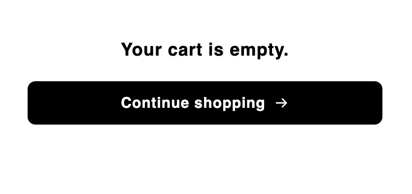
The Empty cart block is the content shown when the cart has no items, typically a message and a continue-shopping button, so an empty drawer is still useful and on-brand. It only appears in the cart’s empty state; other blocks (such as Header) can sit alongside it in that same state.
Behavior
- The block appears only when the cart is empty. As soon as a shopper adds an item, the cart switches to its filled state and this block is replaced by your filled-cart layout.
- In the editor, the CTA link is inert so clicking it doesn’t navigate you away while designing.
Settings
Placement and limits
- Region: body.
- Maximum: 1 per cart state.
- State: empty cart only. This block does not appear in the filled state. New carts also include a Header in the empty state by default; see How do carts work?.
- Added to new carts by default. Not locked — you can remove or hide it.
Custom template
Supports a custom template from its Code tab, which replaces this block’s built-in markup with your JSX. These are the props it receives.This block only renders when the cart is empty, so there’s no cart object in the props. Render
href as a real <a> rather than a scripted navigation, and text with dangerouslySetInnerHTML, since it’s already sanitized HTML.Design
Style this block with its Design section in the settings panel. These are per-block overrides that layer on top of your global design and fall back to it when blank.Text
The Text section in Design lets you control the typography of two elements. Use the Text element picker to switch between them. Message — the empty-state message text. Bold and text color are set in the Rich Text Editor above (in the Settings tab), not here.
Button label — the text on the continue-shopping button. Text color is set in the Button section of Design.
Button
The Button section lets you style the CTA button independently from the global button design. Use the Default / Hover toggle to switch between the two states.
What are design settings? Learn more here: Design settings.