

如何进入
在此处编辑品牌设置需要 Shopify Plus 套餐。Shopify 仅允许应用在 Plus 上读写结账品牌设置,因此在其他套餐上这些设置无法保存。如果你的商店不在 Plus 上,请改为在 Shopify 结账编辑器中进行相同的更改:在 Shopify 后台前往 Settings → Checkout → Customize。
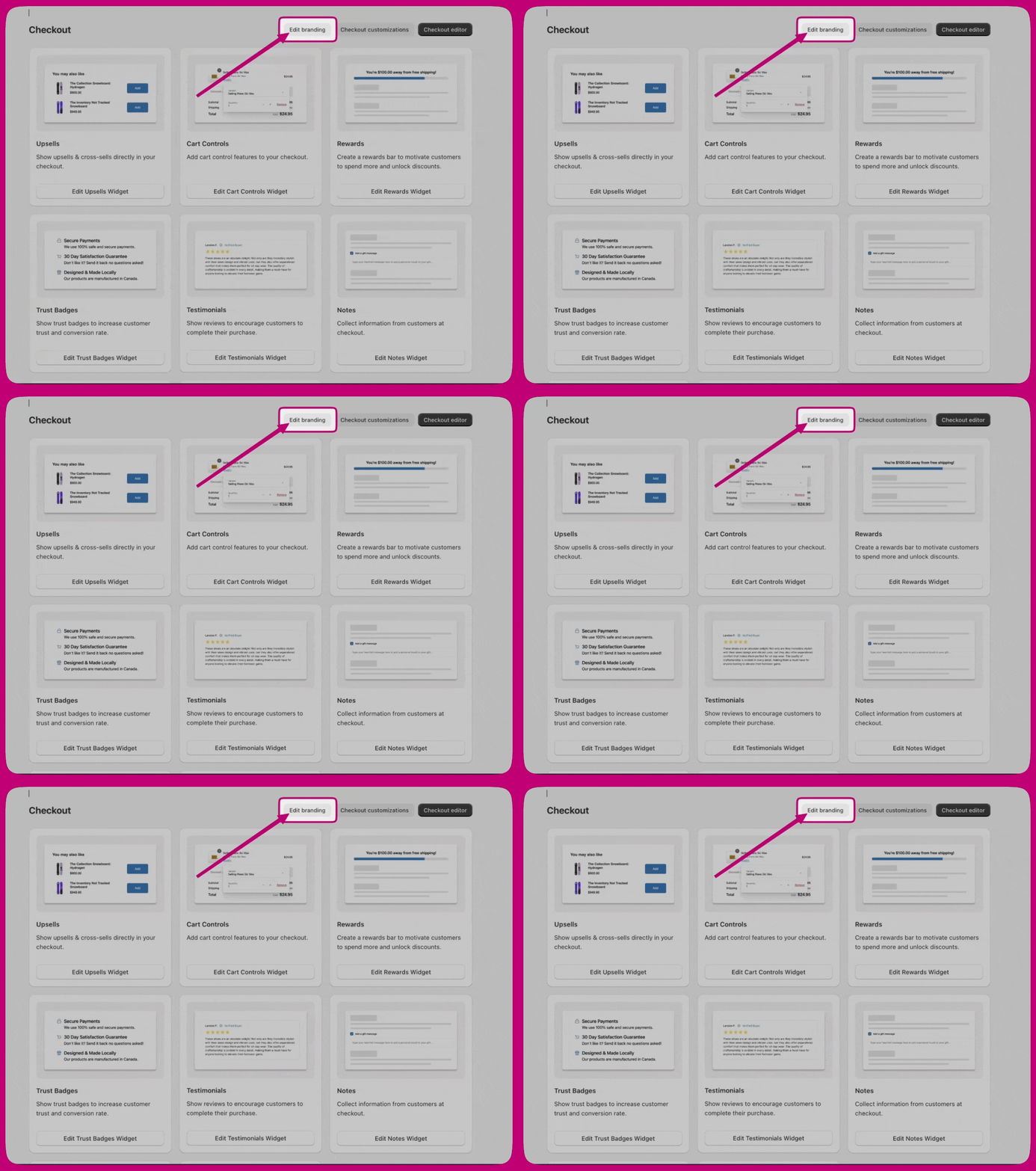
Design system
全局颜色
- Brand——你的主品牌色。
- Accent——用于可交互和高亮元素。
- Decorative——用于辅助性装饰元素。
- Success——确认状态。
- Warning——警示信息。
- Critical——错误和警报。
- Info——提示信息。
表面颜色和按钮颜色不在这里设置。它们位于 Advanced > Color schemes 下。
排版
- Font size——设置 Base size 和用于推导其余字号阶梯的 Scale ratio。
- Primary font——用于大多数组件,如正文文本、按钮和表单控件。选择 Font family、Base weight 和 Bold weight。
- Secondary font——用于标题组件,具有相同的三个控件。
圆角
Customizations
- Corner radius——Small、Medium、Large 或 None(直角)。
- Background——Solid 或 None。
- Vertical padding 和 Horizontal padding。
- Show border。
按钮颜色继承自配色方案。如果没有设置方案值,则使用全局颜色。
表单字段
- Corner radius
- Label position——Inside 或 Outside。
- Show border
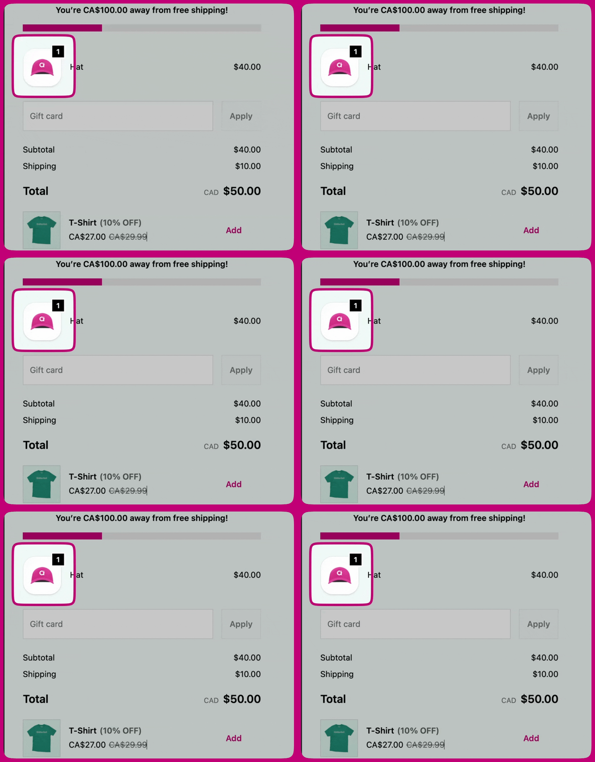
产品缩略图
- Show border
- Border radius
- Fit
- Badge background color——Accent(方案强调色)或 Base(方案基础色)。
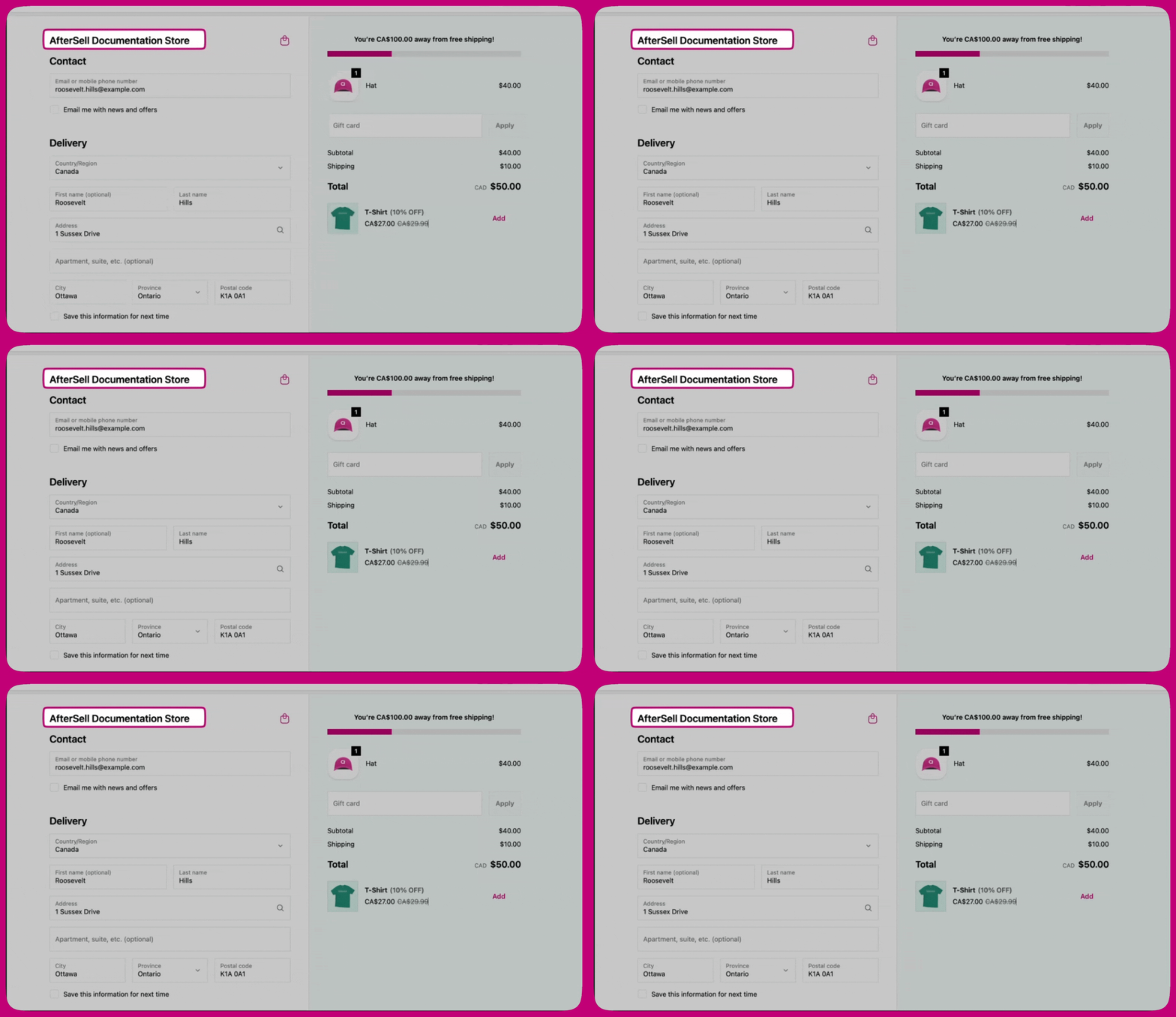
页眉
- Layout——Placement(Top bar、Left section 或 Right section)和 Alignment(Left、Center 或 Right)。
- Container——Padding、Color scheme 和 Show divider。
内容区域
主区域
- Section containers——每个区块外围的背景和边框:Background、Show border、Border style、Border weight。
- Section dividers——区块之间显示的分隔线。
订单摘要
- Container——应用到整个订单摘要容器的 Color scheme。
- Section dividers——Show divider、Border style、Border weight。
- Section containers——每个区块周围的背景和边框:Show border、Background、Border style、Border weight、Color scheme、Corner radius、Padding 和 Shadow。
- Layout——Placement 和 Alignment。
- Container——Show footer content、Padding、Color scheme 和 Show divider。
Advanced
配色方案
- Scheme 1 - Main area
- Scheme 2 - Supporting areas
- Buttons——用于主支付按钮和辅助操作。Primary button 和 Secondary button 分别配置,各自拥有默认状态和悬停状态。
- Form controls——用于文本字段、下拉菜单和选择列表。
- Base surfaces——表面背景、正文文本以及辅助角色:边框、强调(链接和焦点)、装饰(微妙高亮)和图标颜色。