 `cartQuantity`
* **类型**:`string`
* **描述**:购物车中当前的商品数量,格式化为字符串
* **用法**:在你的自定义页眉设计中显示购物车商品数量
```
`cartQuantity`
* **类型**:`string`
* **描述**:购物车中当前的商品数量,格式化为字符串
* **用法**:在你的自定义页眉设计中显示购物车商品数量
```
 `announcementTemplate`
* **类型**:`string`
* **描述**:公告消息的 HTML 内容
* **用法**:在你的自定义实现中显示公告消息
```
```
`timer`
* **类型**:`string`
* **描述**:当前计时器值,格式化为字符串
* **用法**:在自定义公告实现中显示倒计时器
```
`announcementTemplate`
* **类型**:`string`
* **描述**:公告消息的 HTML 内容
* **用法**:在你的自定义实现中显示公告消息
```
```
`timer`
* **类型**:`string`
* **描述**:当前计时器值,格式化为字符串
* **用法**:在自定义公告实现中显示倒计时器
```
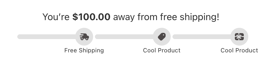 `rewardsMessageHtml`
* **类型**:`string`
* **描述**:奖励消息的 HTML 内容
* **用法**:在自定义实现中以富文本格式显示奖励消息
```
```
`milestonesCompleted`
* **类型**:`number`
* **描述**:已完成的里程碑数量
* **用法**:显示完成数量或计算完成百分比
```
`rewardsMessageHtml`
* **类型**:`string`
* **描述**:奖励消息的 HTML 内容
* **用法**:在自定义实现中以富文本格式显示奖励消息
```
```
`milestonesCompleted`
* **类型**:`number`
* **描述**:已完成的里程碑数量
* **用法**:显示完成数量或计算完成百分比
```
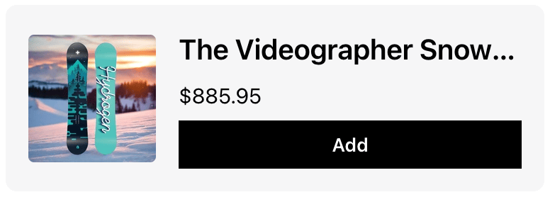 *推荐磁贴模板与 Upsells 模块中的 [upsell 磁贴模板具有相同的 prop 接口](#available-props-upsell-tile-template)。所有可用的 props、类型和用法示例都记录在下方的 Upsells 模块部分。*
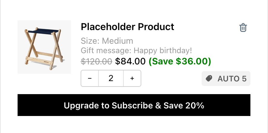 `title`
* **类型**:`string`
* **描述**:商品标题/名称
* **用法**:在购物车商品中显示主要商品名称
`variant`
* **类型**:`React.ReactNode`
* **描述**:预渲染的变体信息组件
* **用法**:以 React 组件形式显示变体详情
`properties`
* **类型**:`React.ReactNode`
* **描述**:预渲染的商品属性组件
* **用法**:以 React 组件形式显示商品属性和订阅信息
`bundle`
* **类型**:`React.ReactNode`
* **描述**:预渲染的套装详情组件
* **用法**:以 React 组件形式显示套装信息
`compareAtPrice`
* **类型**:`string | undefined`
* **描述**:格式化的原价(compare-at price)
* **用法**:为促销商品显示原价
`price`
* **类型**:`string`
* **描述**:格式化的当前价格
* **用法**:显示商品当前价格
`savings`
* **类型**:`string | undefined`
* **描述**:格式化的节省金额
* **用法**:显示客户节省了多少
`imageUrl`
* **类型**:`string | undefined`
* **描述**:商品图片 URL
* **用法**:显示商品图片
`productUrl`
* **类型**:`string | undefined`
* **描述**:商品页面 URL
* **用法**:链接到商品详情页
`quantity`
* **类型**:`number`
* **描述**:购物车中该商品的当前数量
* **用法**:显示和管理商品数量
`showQuantitySelector`
* **类型**:`boolean`
* **描述**:是否显示数量控件
* **用法**:有条件地显示数量选择器
`discountCodes`
* **类型**:`string[] | undefined`
* **描述**:应用于此商品的折扣码数组
* **用法**:显示商品特定的折扣
`subscription`
* **类型**:
```
{
subscriptionUpgradeData: {
buttonText: string;
defaultSellingPlanId: number;
} | null;
sellingPlansData: {
sellingPlanGroups: {
name: string;
selling_plans: {
id: number;
name: string;
}[];
}[] | null;
activeSellingPlanId: string;
oneTimePurchaseText: string | null;
} | null;
upgradeSellingPlan: (item: CartItem, sellingPlanId: number) => void;
changeSellingPlan: (item: CartItem, value: string) => void;
getSellingPlanGroupText: (groupName: string, planName: string) => string;
}
```
* **描述**:完整的订阅管理对象,包含升级数据、销售方案和处理函数
* **用法**:管理订阅功能
* 该 subscription 对象包含:
* **subscriptionUpgradeData**:升级信息(如果没有可用升级则为 null)
* `buttonText`:升级按钮的文本
* `defaultSellingPlanId`:用于升级的默认销售方案 ID
* **sellingPlansData**:可用的销售方案选项(如果没有方案则为 null)
* `sellingPlanGroups`:方案组数组,包含各自的销售方案
* `activeSellingPlanId`:当前选中的销售方案 ID
* `oneTimePurchaseText`:一次性购买选项的文本(如果不可用则为 null)
* **upgradeSellingPlan**:升级到特定销售方案的函数
* **changeSellingPlan**:更改当前销售方案的函数
* **getSellingPlanGroupText**:格式化销售方案显示文本的工具函数
`onIncrease`
* **类型**:`() => void`
* **描述**:增加商品数量的函数
* **用法**:处理数量增加操作
`onDecrease`
* **类型**:`() => void`
* **描述**:减少商品数量的函数
* **用法**:处理数量减少操作
`onDeleteProduct`
* **类型**:`() => void`
* **描述**:从购物车中移除商品的函数
* **用法**:处理商品移除
`onQuantityChange`
* **类型**:`(quantity: string) => void`
* **描述**:处理数量直接输入的函数
* **用法**:处理手动数量更改
`handleInputChange`
* **类型**:`(e: React.ChangeEvent
`title`
* **类型**:`string`
* **描述**:商品标题/名称
* **用法**:在购物车商品中显示主要商品名称
`variant`
* **类型**:`React.ReactNode`
* **描述**:预渲染的变体信息组件
* **用法**:以 React 组件形式显示变体详情
`properties`
* **类型**:`React.ReactNode`
* **描述**:预渲染的商品属性组件
* **用法**:以 React 组件形式显示商品属性和订阅信息
`bundle`
* **类型**:`React.ReactNode`
* **描述**:预渲染的套装详情组件
* **用法**:以 React 组件形式显示套装信息
`compareAtPrice`
* **类型**:`string | undefined`
* **描述**:格式化的原价(compare-at price)
* **用法**:为促销商品显示原价
`price`
* **类型**:`string`
* **描述**:格式化的当前价格
* **用法**:显示商品当前价格
`savings`
* **类型**:`string | undefined`
* **描述**:格式化的节省金额
* **用法**:显示客户节省了多少
`imageUrl`
* **类型**:`string | undefined`
* **描述**:商品图片 URL
* **用法**:显示商品图片
`productUrl`
* **类型**:`string | undefined`
* **描述**:商品页面 URL
* **用法**:链接到商品详情页
`quantity`
* **类型**:`number`
* **描述**:购物车中该商品的当前数量
* **用法**:显示和管理商品数量
`showQuantitySelector`
* **类型**:`boolean`
* **描述**:是否显示数量控件
* **用法**:有条件地显示数量选择器
`discountCodes`
* **类型**:`string[] | undefined`
* **描述**:应用于此商品的折扣码数组
* **用法**:显示商品特定的折扣
`subscription`
* **类型**:
```
{
subscriptionUpgradeData: {
buttonText: string;
defaultSellingPlanId: number;
} | null;
sellingPlansData: {
sellingPlanGroups: {
name: string;
selling_plans: {
id: number;
name: string;
}[];
}[] | null;
activeSellingPlanId: string;
oneTimePurchaseText: string | null;
} | null;
upgradeSellingPlan: (item: CartItem, sellingPlanId: number) => void;
changeSellingPlan: (item: CartItem, value: string) => void;
getSellingPlanGroupText: (groupName: string, planName: string) => string;
}
```
* **描述**:完整的订阅管理对象,包含升级数据、销售方案和处理函数
* **用法**:管理订阅功能
* 该 subscription 对象包含:
* **subscriptionUpgradeData**:升级信息(如果没有可用升级则为 null)
* `buttonText`:升级按钮的文本
* `defaultSellingPlanId`:用于升级的默认销售方案 ID
* **sellingPlansData**:可用的销售方案选项(如果没有方案则为 null)
* `sellingPlanGroups`:方案组数组,包含各自的销售方案
* `activeSellingPlanId`:当前选中的销售方案 ID
* `oneTimePurchaseText`:一次性购买选项的文本(如果不可用则为 null)
* **upgradeSellingPlan**:升级到特定销售方案的函数
* **changeSellingPlan**:更改当前销售方案的函数
* **getSellingPlanGroupText**:格式化销售方案显示文本的工具函数
`onIncrease`
* **类型**:`() => void`
* **描述**:增加商品数量的函数
* **用法**:处理数量增加操作
`onDecrease`
* **类型**:`() => void`
* **描述**:减少商品数量的函数
* **用法**:处理数量减少操作
`onDeleteProduct`
* **类型**:`() => void`
* **描述**:从购物车中移除商品的函数
* **用法**:处理商品移除
`onQuantityChange`
* **类型**:`(quantity: string) => void`
* **描述**:处理数量直接输入的函数
* **用法**:处理手动数量更改
`handleInputChange`
* **类型**:`(e: React.ChangeEvent
### **可用 Props - Variant template**
 `item`
* **类型**:`CartItem`(参考[下方](#cartitem-object-properties)的 `CartItem` 类型)
* **描述**:包含变体信息的原始购物车商品数据
* **用法**:从购物车商品中访问变体详情
`item`
* **类型**:`CartItem`(参考[下方](#cartitem-object-properties)的 `CartItem` 类型)
* **描述**:包含变体信息的原始购物车商品数据
* **用法**:从购物车商品中访问变体详情
### **可用 Props - Properties template**
 `productProperties`
* **类型**:`{ key: string; value: string; isUrl?: boolean; }[]`
* **描述**:商品属性数组(自定义字段、订单项属性)
`subscriptionLabel`
* **类型**:`string | undefined`
* **描述**:订阅信息的标签
`productProperties`
* **类型**:`{ key: string; value: string; isUrl?: boolean; }[]`
* **描述**:商品属性数组(自定义字段、订单项属性)
`subscriptionLabel`
* **类型**:`string | undefined`
* **描述**:订阅信息的标签
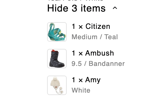
### **可用 Props - Bundle template**
 `getSizedImageUrl`
* **类型**:`getSizedImageUrl: ({ src, width, height }: SizedImageParams) => string`
* **描述**:获取正确尺寸图片 URL 的工具函数
`item`
* **类型**:
```
{
itemComponents: {
quantity: number;
image: {
url: string;
height: number | null;
width: number | null;
alt: string;
};
product: {
title: string;
has_only_default_variant: boolean;
};
variantTitle: string;
}[];
variantTitle: string | undefined;
hasComponents: boolean;
}
```
* **描述**:套装商品信息,包括组件。`itemComponents` 是组件对象数组——对其进行 map 以渲染每个套装组件。
`showDetailsText`
* **类型**:`string | undefined`
* **描述**:"显示详情"操作的文本
* **用法**:显示展开按钮文本
`hideDetailsText`
* **类型**:`string | undefined`
* **描述**:"隐藏详情"操作的文本
`isExpanded`
* **类型**:`boolean`
* **描述**:套装详情是否已展开
`toggleCollapsible`
* **类型**:`() => void`
* **描述**:切换套装详情可见性的函数
* **用法**:处理展开/折叠操作
`chevronDownIconComponent`
* **类型**:`React.ReactElement`
* **描述**:预渲染的展开/折叠 V 形图标
* **用法**:显示一致的展开/折叠指示器
`getSizedImageUrl`
* **类型**:`getSizedImageUrl: ({ src, width, height }: SizedImageParams) => string`
* **描述**:获取正确尺寸图片 URL 的工具函数
`item`
* **类型**:
```
{
itemComponents: {
quantity: number;
image: {
url: string;
height: number | null;
width: number | null;
alt: string;
};
product: {
title: string;
has_only_default_variant: boolean;
};
variantTitle: string;
}[];
variantTitle: string | undefined;
hasComponents: boolean;
}
```
* **描述**:套装商品信息,包括组件。`itemComponents` 是组件对象数组——对其进行 map 以渲染每个套装组件。
`showDetailsText`
* **类型**:`string | undefined`
* **描述**:"显示详情"操作的文本
* **用法**:显示展开按钮文本
`hideDetailsText`
* **类型**:`string | undefined`
* **描述**:"隐藏详情"操作的文本
`isExpanded`
* **类型**:`boolean`
* **描述**:套装详情是否已展开
`toggleCollapsible`
* **类型**:`() => void`
* **描述**:切换套装详情可见性的函数
* **用法**:处理展开/折叠操作
`chevronDownIconComponent`
* **类型**:`React.ReactElement`
* **描述**:预渲染的展开/折叠 V 形图标
* **用法**:显示一致的展开/折叠指示器
### **可用 Props - Price template**
 `compareAtPrice`
* **类型**:`string | undefined`
* **描述**:格式化的原价(compare-at price)
* **用法**:为促销商品显示原价
`price`
* **类型**:`string`
* **描述**:格式化的当前价格
* **用法**:显示商品当前价格
`savings`
* **类型**:`string | undefined`
* **描述**:格式化的节省金额
* **用法**:显示客户节省了多少
`compareAtPrice`
* **类型**:`string | undefined`
* **描述**:格式化的原价(compare-at price)
* **用法**:为促销商品显示原价
`price`
* **类型**:`string`
* **描述**:格式化的当前价格
* **用法**:显示商品当前价格
`savings`
* **类型**:`string | undefined`
* **描述**:格式化的节省金额
* **用法**:显示客户节省了多少
### **CartItem 对象属性**
`CartItem` 对象包含购物车订单项的所有详细信息。该对象在 Product Tile 模板中以 props.rawItem 提供,在 Variant 模板中以 props.item 提供。
#### **核心标识**
* `key (string)` - 此购物车商品的唯一标识符。
* `id (number)` - 变体 ID(旧字段,请改用 variant\_id)
* `variant_id (number)` - 此商品的 Shopify 变体 ID
* `product_id (number)` - Shopify 商品 ID
* `lineIdxFrom1 (number)` - 此商品在修改前原始购物车中的索引(从 1 开始)
#### **商品信息**
* `title (string)` - 订单项标题(通常是变体标题)
* `product_title (string)` - 主商品标题
* `handle (string)` - 商品 URL handle(例如 "camp-stool")
* `vendor (string)` - 商品供应商/品牌名称
* `product_type (string)` - 用于税务目的的商品类别/类型
* `sku (string)` - 库存单位标识符
* `product_description (string)` - 完整的商品描述
* `product_has_only_default_variant (boolean)` - 商品是否只有一个变体
#### **定价(所有价格以分为单位)**
* `quantity (number)` - 购物车中此商品的数量
* `price (number)` - 折扣前的单价
* `original_price (number)` - 与 price 相同
* `discounted_price (number)` - 商品级折扣后的单价
* `compare_at_price (number | null)` - 原价(MSRP)。注意:此字段由 Upcart 添加,不是由 Shopify 的购物车 API 提供
* `final_line_price (number)` - 商品级折扣后的总价(quantity × discounted\_price)
* `original_line_price (number)` - 折扣前的总价(quantity × price)
* `line_price (number)` - 所有折扣后的总价
* `final_price (number)` - **已弃用** - 商品折扣后的单价(不考虑数量)
* `total_discount (number)` - 与 line\_level\_total\_discount 相同
* `line_level_total_discount (number)` - 应用于此订单项的总折扣金额
#### **媒体和 URL**
* `image (string)` - 主要商品图片 URL
* `url (string)` - 商品页面的相对 URL 路径(例如 "/products/camp-stool?variant=42789611372803")
* `featured_image (object | null)` - 主图详情:
* `alt (string)` - 图片替代文本
* `aspect_ratio (number)` - 图片宽高比
* `height (number)` - 图片高度(像素)
* `url (string)` - 图片 URL
* `width (number)` - 图片宽度(像素)
#### **变体和选项**
* `variant_title (string | null)` - 变体标题(例如 "Large / Red")
* `variant_options (string[])` - 变体选项值数组
* `options_with_values (Array)` - 详细的选项信息:
* `name (string)` - 选项名称(例如 "Size")
* `value (string)` - 选项值(例如 "Large")
* `untranslated_product_title (string | undefined)` - 翻译前的原始商品标题(仅在购物车变更响应中提供)
* `untranslated_variant_title (string | undefined)` - 翻译前的原始变体标题(仅在购物车变更响应中提供)
#### **自定义属性和元数据**
* `properties (Record
#### **折扣和促销**
* `discounts (Array)` - 简化的折扣信息:
* `amount (number)` - 折扣金额(分)
* `title (string)` - 折扣标题/名称
* `line_level_discount_allocations (Array)` - 详细的折扣分配信息:
* `amount (number)` - 折扣金额(分)
* `discount_application (object)` - 完整的折扣应用详情:
* `allocation_method (string)` - 折扣的分配方式
* `created_at (string)` - 折扣创建时间
* `description (string | null)` - 折扣描述
* `key (string)` - 折扣键标识符
* `target_selection (string)` - 折扣的目标选择
* `target_type (string)` - 目标类型
* `title (string)` - 折扣标题
* `total_allocated_amount (number)` - 分配的总金额
* `type ('discount_code' | '')` - 折扣类型(自动折扣为空字符串)
* `value (string)` - 折扣值
* `value_type (string)` - 值的应用方式
#### **套装商品**
* `has_components (boolean | undefined)` - 此商品是否为包含其他商品的套装(仅在 GET 购物车响应中提供)
* `item_components (Array | null | undefined)` - 套装组件详情:
* `quantity (number)` - 此组件的数量
* `image (object)` - 组件图片:
* `url (string)` - 图片 URL
* `height (number | null)` - 图片高度
* `width (number | null)` - 图片宽度
* `alt (string)` - 替代文本
* `product (object)` - 组件商品信息:
* `title (string)` - 商品标题
* `has_only_default_variant (boolean)` - 商品是否只有默认变体
* `variantTitle (string)` - 组件变体标题
#### **业务规则**
* `quantity_rule (object | undefined)` - 数量约束(仅在 GET 购物车响应中提供):
* `min (number)` - 允许的最小数量
* `max (number | null)` - 允许的最大数量(null = 无限制)
* `increment (number)` - 数量增量步长
#### **订阅信息**
* `selling_plan_allocation (object | undefined)` - 订阅/销售方案详情:
* `price (number)` - 订阅价格(分)
* `compare_at_price (number | null)` - 订阅原价
* `per_delivery_price (number)` - 每次配送的价格
* `selling_plan (object)` - 销售方案详情:
* `id (number)` - 销售方案 ID
* `name (string)` - 方案名称
* `description (string)` - 方案描述
* `options (Array)` - 方案选项:
* `name (string)` - 选项名称
* `position (number)` - 选项位置
* `value (string)` - 选项值
* `recurring_deliveries (boolean)` - 方案是否包含循环配送
#### **集成元数据**
* `__appIntegrated (object | undefined)` - 第三方应用集成数据:
* `app ('stay.ai')` - 已集成应用的标识符
* `bundleRole ('parent' | 'child')` - 在套装结构中的角色
## Upsells
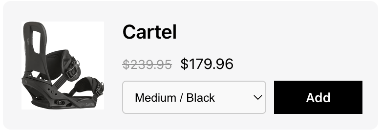
Upsells 模块允许你使用自己的设计自定义 upsell 商品显示,同时保持基本的电商功能,例如变体选择、加购操作和商品信息显示。
### **可用 Props - Upsell tile template**
 `itemUrl`
* **类型**:`string`
* **描述**:商品页面的 URL
* **用法**:创建指向商品详情页的链接,以增强用户导航
```
`itemUrl`
* **类型**:`string`
* **描述**:商品页面的 URL
* **用法**:创建指向商品详情页的链接,以增强用户导航
```
{props.productTitle}
## Additional Notes
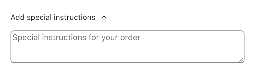
Notes 模块允许你使用自己的设计自定义购物车备注功能,同时保持基本的备注功能,例如可展开区域、文本输入处理和加载状态。
### **可用 Props - Full template**
 `cartNote`
* **类型**:`string`
* **描述**:客户输入的当前购物车备注内容
* **用法**:在自定义实现中显示和管理购物车备注文本
```
```
`notesPlaceholder`
* **类型**:`string`
* **描述**:备注输入字段的占位符文本
* **用法**:为客户提供关于备注内容的指引
```
```
`notesTitle`
* **类型**:`string`
* **描述**:备注区域的标题/页眉文本
* **用法**:在自定义备注实现中显示区域标题
```
```
`chevronDownIconComponent`
* **类型**:`React.ReactElement`
* **描述**:用于展开/折叠功能的预渲染 V 形图标组件
* **用法**:在自定义实现中显示一致的展开/折叠指示器
`loadingIndicatorComponent`
* **类型**:`React.ReactElement | null`
* **描述**:用于异步操作的预渲染加载指示器组件
* **用法**:在备注保存操作期间显示加载状态
`handleCartNoteChange`
* **类型**:`(newCartNote: string) => void`
* **描述**:处理购物车备注内容更改的函数
* **用法**:当用户修改文本时更新购物车备注
`isExpanded`
* **类型**:`boolean`
* **描述**:指示备注区域当前是否展开
* **用法**:控制备注输入区域的可见性
`toggleCollapsible`
* **类型**:`() => void`
* **描述**:切换备注区域展开/折叠状态的函数
* **用法**:绑定到按钮或交互元素上以控制区域可见性
***
`cartNote`
* **类型**:`string`
* **描述**:客户输入的当前购物车备注内容
* **用法**:在自定义实现中显示和管理购物车备注文本
```
```
`notesPlaceholder`
* **类型**:`string`
* **描述**:备注输入字段的占位符文本
* **用法**:为客户提供关于备注内容的指引
```
```
`notesTitle`
* **类型**:`string`
* **描述**:备注区域的标题/页眉文本
* **用法**:在自定义备注实现中显示区域标题
```
```
`chevronDownIconComponent`
* **类型**:`React.ReactElement`
* **描述**:用于展开/折叠功能的预渲染 V 形图标组件
* **用法**:在自定义实现中显示一致的展开/折叠指示器
`loadingIndicatorComponent`
* **类型**:`React.ReactElement | null`
* **描述**:用于异步操作的预渲染加载指示器组件
* **用法**:在备注保存操作期间显示加载状态
`handleCartNoteChange`
* **类型**:`(newCartNote: string) => void`
* **描述**:处理购物车备注内容更改的函数
* **用法**:当用户修改文本时更新购物车备注
`isExpanded`
* **类型**:`boolean`
* **描述**:指示备注区域当前是否展开
* **用法**:控制备注输入区域的可见性
`toggleCollapsible`
* **类型**:`() => void`
* **描述**:切换备注区域展开/折叠状态的函数
* **用法**:绑定到按钮或交互元素上以控制区域可见性
***
## Add-ons
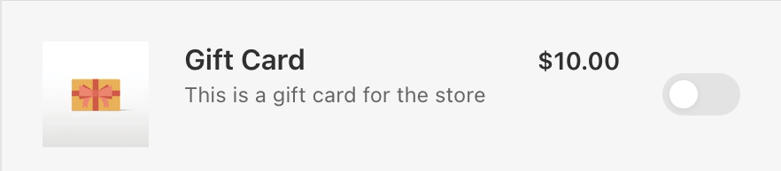
Addons 模块允许你使用自己的设计自定义附加商品显示,同时保持基本的电商功能,例如商品信息显示、定价、切换控件和货币格式化。
### **可用 Props - Full template**
 `addonProduct`
* **类型**:
```
{
product: {
id: number;
title: string;
description: string;
};
variant: {
id: number;
price: number;
compare_at_price: number | null;
};
image: {
src: string;
alt: string;
};
}
```
* **描述**:完整的附加商品信息,包括商品详情、变体定价和图片数据
* **用法**:访问显示附加商品所需的所有商品信息
* **结构**:包含嵌套的 product、variant 和 image 对象,提供全面的商品数据
* **Product 对象属性** `addonProduct.product`
* **id**:商品的唯一数字标识符
* **title**:附加商品的显示名称
* **description**:商品的 HTML 描述内容
* **Variant 对象属性**
* **id**:变体的唯一数字标识符
* **price**:当前价格(分)
* **compare\_at\_price**:原价(分)(如果没有比较价格则为 null)
* **Image 对象属性**
* **src**:商品图片的 URL
* **alt**:图片的替代文本(用于无障碍访问)
`toggle`
* **类型**:
```
{
state: 'enabled' | 'disabled' | 'loading';
handleEnable: () => void;
handleDisable: () => void;
} | null
```
* **描述**:用于启用/禁用附加项的切换控件状态和处理程序
* **用法**:实现附加项选择的交互式切换功能
* **状态**:三种可能的状态——enabled、disabled 和 loading
* **处理程序**:分别用于启用和禁用操作的独立函数
`moneyFormat`
* **类型**:`string`
* **描述**:用于价格格式化的货币格式字符串
* **用法**:传递给 formatMoney 函数以实现一致的货币显示
`formatMoney`
* **类型**:
```
(options: {
cents: string | number;
format?: string;
shouldRemoveHTML?: boolean;
}) => string
```
* **描述**:用于格式化货币值的工具函数
* **用法**:按照商店货币设置一致地格式化价格
* **参数**:接受分值、可选的格式字符串和 HTML 移除选项
`addonProduct`
* **类型**:
```
{
product: {
id: number;
title: string;
description: string;
};
variant: {
id: number;
price: number;
compare_at_price: number | null;
};
image: {
src: string;
alt: string;
};
}
```
* **描述**:完整的附加商品信息,包括商品详情、变体定价和图片数据
* **用法**:访问显示附加商品所需的所有商品信息
* **结构**:包含嵌套的 product、variant 和 image 对象,提供全面的商品数据
* **Product 对象属性** `addonProduct.product`
* **id**:商品的唯一数字标识符
* **title**:附加商品的显示名称
* **description**:商品的 HTML 描述内容
* **Variant 对象属性**
* **id**:变体的唯一数字标识符
* **price**:当前价格(分)
* **compare\_at\_price**:原价(分)(如果没有比较价格则为 null)
* **Image 对象属性**
* **src**:商品图片的 URL
* **alt**:图片的替代文本(用于无障碍访问)
`toggle`
* **类型**:
```
{
state: 'enabled' | 'disabled' | 'loading';
handleEnable: () => void;
handleDisable: () => void;
} | null
```
* **描述**:用于启用/禁用附加项的切换控件状态和处理程序
* **用法**:实现附加项选择的交互式切换功能
* **状态**:三种可能的状态——enabled、disabled 和 loading
* **处理程序**:分别用于启用和禁用操作的独立函数
`moneyFormat`
* **类型**:`string`
* **描述**:用于价格格式化的货币格式字符串
* **用法**:传递给 formatMoney 函数以实现一致的货币显示
`formatMoney`
* **类型**:
```
(options: {
cents: string | number;
format?: string;
shouldRemoveHTML?: boolean;
}) => string
```
* **描述**:用于格式化货币值的工具函数
* **用法**:按照商店货币设置一致地格式化价格
* **参数**:接受分值、可选的格式字符串和 HTML 移除选项
## Discount Codes
Discount Code 模块允许你使用自己的设计自定义折扣码输入功能,同时保持基本的电商功能,例如代码验证、表单提交和用户反馈。
### **可用 Props - Full template**
 `indicator`
* **类型**:`'validating' | 'invalid' | 'none'`
* **描述**:折扣码输入的当前验证状态
* **用法**:根据验证状态显示适当的 UI 反馈
* **状态**:
* `validating`:代码正在处理/验证中
* `invalid`:代码验证失败
* `none`:无验证状态(默认/空闲)
`discountCodeInput`
* **类型**:`string`
* **描述**:折扣码输入字段的当前值
* **用法**:显示和管理用户输入的折扣码文本
```
props.setDiscountCodeInput(e.target.value)}
...
/>
```
`discountCodePlaceholder`
* **类型**:`string`
* **描述**:折扣码输入字段的占位符文本
* **用法**:为用户提供关于输入内容的指引
`discountCodeButtonText`
* **类型**:`string`
* **描述**:应用/提交按钮上显示的文本
* **用法**:自定义折扣码提交按钮的文本
`setDiscountCodeInput`
* **类型**:`(value: string | ((prev: string) => string)) => void`
* **描述**:更新折扣码输入值的函数
* **用法**:处理折扣码字段中的用户输入更改
`handleSubmit`
* **类型**:`(e: React.FormEvent
`indicator`
* **类型**:`'validating' | 'invalid' | 'none'`
* **描述**:折扣码输入的当前验证状态
* **用法**:根据验证状态显示适当的 UI 反馈
* **状态**:
* `validating`:代码正在处理/验证中
* `invalid`:代码验证失败
* `none`:无验证状态(默认/空闲)
`discountCodeInput`
* **类型**:`string`
* **描述**:折扣码输入字段的当前值
* **用法**:显示和管理用户输入的折扣码文本
```
props.setDiscountCodeInput(e.target.value)}
...
/>
```
`discountCodePlaceholder`
* **类型**:`string`
* **描述**:折扣码输入字段的占位符文本
* **用法**:为用户提供关于输入内容的指引
`discountCodeButtonText`
* **类型**:`string`
* **描述**:应用/提交按钮上显示的文本
* **用法**:自定义折扣码提交按钮的文本
`setDiscountCodeInput`
* **类型**:`(value: string | ((prev: string) => string)) => void`
* **描述**:更新折扣码输入值的函数
* **用法**:处理折扣码字段中的用户输入更改
`handleSubmit`
* **类型**:`(e: React.FormEvent
## Cart Summary
Cart Summary 模块允许你使用自己的设计自定义购物车摘要和折扣显示,同时保持基本的电商功能,例如折扣管理、节省金额计算和价格透明度。
### **可用 Props - Full template**
 `totalSavingsText`
* **类型**:`string`
* **描述**:总节省金额区域的文本标签
* **用法**:在自定义购物车摘要实现中显示节省标签
`discountApplications`
* **类型**:
```
{
key: string;
title: string;
type: 'discount_code' | '';
}[]
```
* **描述**:已应用的折扣码和自动折扣的数组
* **用法**:显示所有生效的折扣及其标题和类型
* **结构**:每个折扣包含唯一键、显示标题和类型标识符
`cartTotalDiscount`
* **类型**:`number`
* **描述**:总折扣金额(分)
* **用法**:访问原始折扣值以进行计算或自定义格式化
`showCartTotalDiscount`
* **类型**:`boolean`
* **描述**:指示是否应显示总折扣。已标记为弃用,推荐使用 `showTotalSavings`,但请参阅下面的说明——在自定义模板中,这仍然是你可用的 prop。
* **用法**:根据设置有条件地渲染折扣信息
`formattedCartTotalDiscount`
* **类型**:`string`
* **描述**:总折扣金额的预格式化 HTML 字符串。已标记为弃用,推荐使用 `formattedTotalSavings`,但请参阅下面的说明。
* **用法**:显示带有货币符号的正确格式化折扣金额
`totalSavingsText`
* **类型**:`string`
* **描述**:总节省金额区域的文本标签
* **用法**:在自定义购物车摘要实现中显示节省标签
`discountApplications`
* **类型**:
```
{
key: string;
title: string;
type: 'discount_code' | '';
}[]
```
* **描述**:已应用的折扣码和自动折扣的数组
* **用法**:显示所有生效的折扣及其标题和类型
* **结构**:每个折扣包含唯一键、显示标题和类型标识符
`cartTotalDiscount`
* **类型**:`number`
* **描述**:总折扣金额(分)
* **用法**:访问原始折扣值以进行计算或自定义格式化
`showCartTotalDiscount`
* **类型**:`boolean`
* **描述**:指示是否应显示总折扣。已标记为弃用,推荐使用 `showTotalSavings`,但请参阅下面的说明——在自定义模板中,这仍然是你可用的 prop。
* **用法**:根据设置有条件地渲染折扣信息
`formattedCartTotalDiscount`
* **类型**:`string`
* **描述**:总折扣金额的预格式化 HTML 字符串。已标记为弃用,推荐使用 `formattedTotalSavings`,但请参阅下面的说明。
* **用法**:显示带有货币符号的正确格式化折扣金额
## Trust Badges
Trust Badges 模块允许你使用自己的设计自定义信任徽章显示,同时保持基本的信任建立功能,例如条件性徽章可见性和正确的图片处理。
### **可用 Props - Full template**
`showBadge`
* **类型**:`boolean`
* **描述**:指示是否应显示信任徽章
* **用法**:根据模块设置控制信任徽章的可见性
`badgeUrl`
* **类型**:`string`
* **描述**:要显示的信任徽章图片的 URL
* **用法**:自定义实现中信任徽章图片的来源 URL