> ## Documentation Index
> Fetch the complete documentation index at: https://docs.aftersell.com/llms.txt
> Use this file to discover all available pages before exploring further.

# 设计模块

> 本文介绍如何自定义你的 Upcart 设计设置。

设计模块允许你自定义购物车的外观，包括布局、品牌颜色和按钮样式。

<div id="general">
  # 常规
</div>

<div id="inherit-fonts-from-theme">
  ## 从主题继承字体
</div>

此设置允许 Upcart 使用你 Shopify 主题设置中定义的字体。要查看当前的字体选择，请打开 [Shopify 主题编辑器](https://help.shopify.com/en/manual/online-store/themes/customizing-themes#access-the-theme-editor)并导航到 Typography 部分。

<div id="cart-preview">
  ## **🚧 购物车预览 🚧**
</div>

从主题继承的字体不会显示在 Upcart 预览窗口中，但会在你的线上店面中正确显示。

<div id="show-strikethrough-prices">
  ## 显示划线价格
</div>

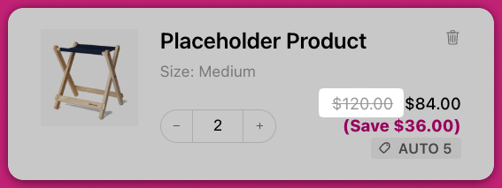
启用此设置可在购物车中每件商品旁显示划线价格（也称为[原价对比](https://help.shopify.com/en/manual/discounts/sales#set-a-compare-at-price-for-a-product)）。这反映了折扣定价，与你的商品页面类似。

<img src="https://mintcdn.com/aftersell/uxKAdY-e0h16xa48/images/upcart/design-cart-item-strikethrough-price.png?fit=max&auto=format&n=uxKAdY-e0h16xa48&q=85&s=1139c85449399309a710241ea0239907" alt="购物车商品在折扣价和节省金额旁显示划线原价" width="567" height="213" data-path="images/upcart/design-cart-item-strikethrough-price.png" />

<div id="enable-subtotal-line">
  ## 启用小计行
</div>

向购物车添加小计行。开启此设置还会在 **Colors** 下显示 **Subtotal text color** 字段，因此小计可以与购物车其余文本分开设置样式。关闭此设置时，该颜色字段会被隐藏。

<div id="cart-width">
  ## 购物车宽度
</div>

控制抽屉的宽度，可针对每种视口分别设置：

* **桌面端**——**Default** 或 **Wide**
* **移动端**——**Full**（贴边）或 **Nearly full**（边缘留一点间隙）

***

<div id="colors">
  # 颜色
</div>

<div id="background-color">
  ## 背景颜色
</div>

设置购物车的主背景颜色，不包括页脚和 upsell 卡片。

<div id="cart-accent-color">
  ## 购物车强调色
</div>

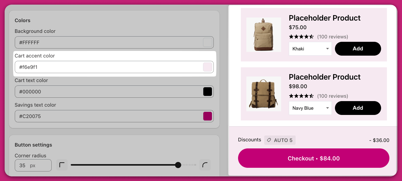
控制购物车页脚和 upsell 商品卡片的背景颜色。

<img src="https://mintcdn.com/aftersell/uxKAdY-e0h16xa48/images/upcart/design-colors-settings-cart-accent.png?fit=max&auto=format&n=uxKAdY-e0h16xa48&q=85&s=997641ba05508c369cd6cea9f23e7a60" alt="Upcart 颜色设置中购物车强调色应用于粉色 upsell 卡片" width="1307" height="589" data-path="images/upcart/design-colors-settings-cart-accent.png" />

<div id="cart-text-color">
  ## 购物车文本颜色
</div>

定义所有购物车文本的颜色，但按钮文本和节省文本除外，它们单独控制。

<div id="savings-text-color">
  ## 节省文本颜色
</div>

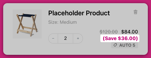
设置商品价格下方显示的节省文本的颜色。

<img src="https://mintcdn.com/aftersell/uxKAdY-e0h16xa48/images/upcart/design-cart-item-savings-amount.png?fit=max&auto=format&n=uxKAdY-e0h16xa48&q=85&s=17965a9012294f1399f7d40f583828ec" alt="购物车商品的节省金额文本以洋红色突出显示" width="572" height="220" data-path="images/upcart/design-cart-item-savings-amount.png" />

<div id="subtotal-text-color">
  ## 小计文本颜色
</div>

设置小计行的颜色。此字段仅在 **General** 下开启 **Enable subtotal line** 时才会显示。

<div id="cart-preview-2">
  ## 🚧 **购物车预览** 🚧
</div>

预览编辑器可能无法精确反映最终样式。你商店的主题可能包含影响文本大小或颜色的自定义 CSS。请务必在线上店面验证更改。

***

<div id="button-settings">
  # 按钮设置
</div>

Upcart 提供高级按钮样式选项，包括对 checkout 按钮的专门自定义。这包括 CSS 调整方法以及集成 Shopify 品牌化工具。

<div id="corner-radius">
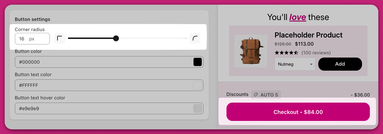
  ## 圆角半径
</div>

调整按钮圆角的弧度，范围为 **0 px 到 40 px**。`0` 表示尖锐的直角；`40` 是滑块的最大圆角。该值同时应用于 checkout 按钮、upsell 按钮、折扣按钮和升级按钮。

<Note>
  滑块最大为 40 px。若想实现完全的胶囊形按钮，你需要使用[自定义 CSS](/zh/upcart/custom_css)——参见下方的 [checkout 按钮的高级 CSS 自定义](#advanced-css-customization-for-checkout-buttons)。
</Note>

<img src="https://mintcdn.com/aftersell/uxKAdY-e0h16xa48/images/upcart/design-corner-radius-slider-16.png?fit=max&auto=format&n=uxKAdY-e0h16xa48&q=85&s=6dadda55065cefb425b9e7b4a10df34c" alt="圆角半径滑块设置为 16 像素，使 checkout 按钮变圆" width="1314" height="461" data-path="images/upcart/design-corner-radius-slider-16.png" />

<div id="button-color">
  ## 按钮颜色
</div>

设置购物车中所有按钮的背景颜色，包括：

* Checkout 按钮
* Upsell "Add to Cart" 按钮
* 折扣 "Apply" 按钮
* 订阅升级按钮 你可以通过 Cart Editor 自定义这些按钮的颜色。如需 CSS 修改等更高级的自定义，请参阅高级自定义部分。

<div id="button-text-color">
  ## 按钮文本颜色
</div>

指定购物车所有按钮使用的文本颜色。

<div id="button-text-hover-color">
  ## 按钮文本悬停颜色
</div>

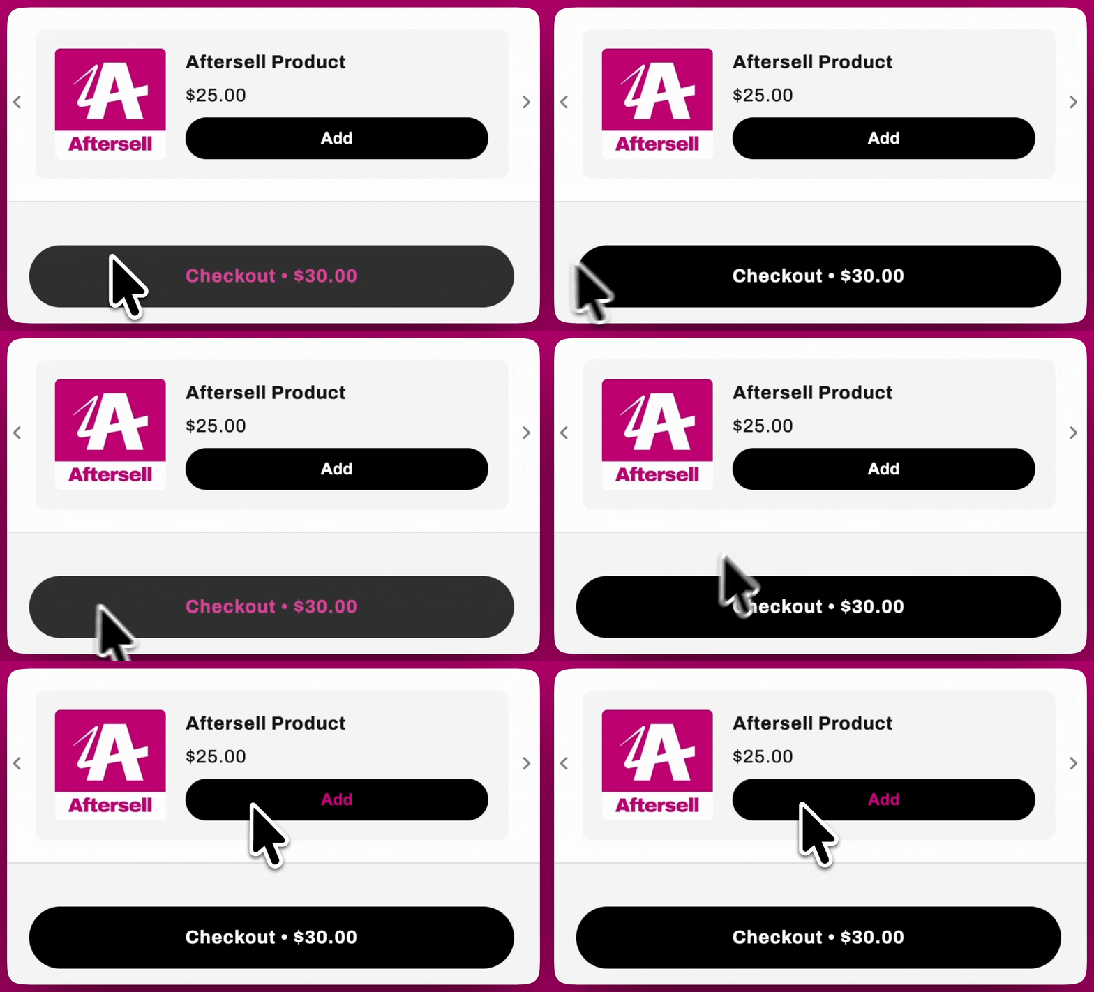
控制客户将鼠标悬停在按钮上时按钮文本的颜色。例如，如果设置为绿色，悬停时文本将变为绿色。

<div id="show-continue-shopping-button">
  ## 显示继续购物按钮
</div>

向购物车添加 **Continue shopping** 按钮，让客户无需使用关闭图标即可关闭抽屉并返回浏览。

<div id="advanced-css-customization-for-checkout-buttons">
  # checkout 按钮的高级 CSS 自定义
</div>

如需大幅度的设计更改，你可以使用自定义 CSS 代码修改 checkout 按钮：

1. 在 Cart Editor 中，打开 **Settings** 并选择 **Custom CSS** 标签页。
2. 使用相关的 CSS 选择器，例如 `.checkout`。示例 CSS 片段：创建胶囊形按钮：
   ```text theme={"theme":{"light":"snazzy-light","dark":"github-dark"}}
   .checkout {    border-radius: 9999px !important;}
   ```
   添加黑色边框：
   ```text theme={"theme":{"light":"snazzy-light","dark":"github-dark"}}
   .checkout {    border: 2px solid black !important;}
   ```
   请将 `.checkout` 替换为你按钮的实际 CSS 类名。其他样式还包括悬停效果、内边距、文本颜色或字体。

<div id="integrating-shopify-branding-for-button-customization">
  # 集成 Shopify 品牌化进行按钮自定义
</div>

如果你在使用 Shopify，可以通过 Shopify 管理后台更新 checkout 按钮的设计：

1. 登录你的 Shopify Admin。
2. 前往 `Settings > Checkout > Customize`。
3. 使用品牌化选项修改字体、圆角或颜色，打造统一的设计。

<Frame>
  <img src="https://mintcdn.com/aftersell/uxKAdY-e0h16xa48/images/upcart/design-cart-drawer-preview.gif?s=5ccbb7ec1acafc03803d5a7842455582" alt="Upcart cart drawer 预览，包含 upsell 的 Add 按钮和 checkout 按钮" width="1784" height="1080" data-path="images/upcart/design-cart-drawer-preview.gif" />
</Frame>