> ## Documentation Index
> Fetch the complete documentation index at: https://docs.aftersell.com/llms.txt
> Use this file to discover all available pages before exploring further.
# 空购物车区块
> 空购物车区块——购物者没有商品时显示的内容。
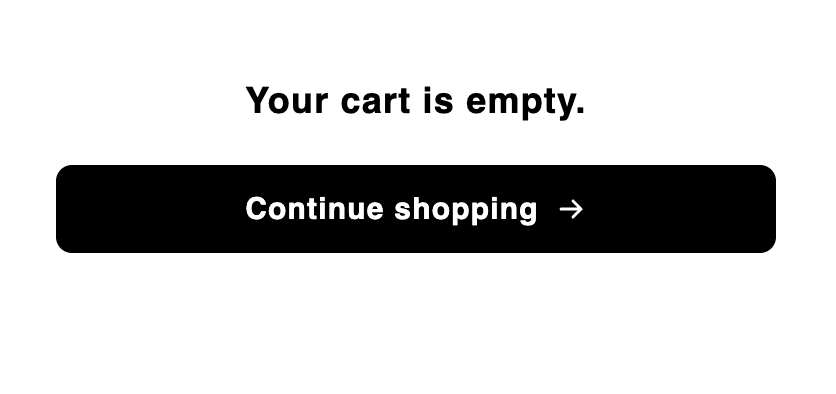
> **Empty cart** 区块是购物车中没有商品时显示的内容,通常是一条消息和一个继续购物按钮,让空抽屉依然实用且符合品牌调性。它只出现在购物车的**空状态**;其他区块(如 Header)可以在同一状态下与它并存。
## 行为
* 该区块仅在购物车为空时出现。购物者一添加商品,购物车就切换到已装满状态,此区块会被你的已装满购物车布局取代。
* 在编辑器中,CTA 链接是不可点击的,这样你在设计时点击它不会跳转离开。
## 设置
| 设置 | 控制内容 | 默认值 |
| -------------------- | ---------------------------------------------------------------------------- | --------------------- |
| **Empty cart text** | 空状态消息。富文本。 | `Your cart is empty.` |
| **Button text** | 按钮文字。支持内联 HTML 格式。 | `Continue shopping` |
| **Button link** | 按钮链接的目标。 | `/collections/all` |
| **Background color** | 区块的背景颜色。留空则保持透明,购物车自身的背景会透出来。 | `transparent` |
| **Alignment** | 区块的文本和按钮如何对齐——**Left** 或 **Center**。 | Center |
| **Fit to height** | 区块是填满购物车主体的剩余高度并垂直居中,还是按内容高度显示——**Fill remaining height** 或 **Fit content**。 | Fill remaining height |
## 位置和限制
* \*\*区域:\*\*主体。
* \*\*数量上限:\*\*每个购物车状态 1 个。
* \*\*状态:\*\*仅限空购物车。此区块不会出现在已装满状态。新购物车默认还会在空状态中包含一个 Header;参阅[购物车如何工作?](/zh/aftersell/cart/how-carts-work)。
* 默认添加到新购物车。未锁定——你可以删除或隐藏它。
## 自定义模板
支持从其 Code 标签页使用[自定义模板](/zh/aftersell/cart/custom-templates),用你的 JSX 替换此区块的内置标记。以下是它接收的 props。
| Prop | 类型 | 用途 |
| --------- | -------- | -------------------------------- |
| `text` | `string` | 空购物车消息,为已消毒的 HTML。 |
| `cta` | `string` | 号召按钮的文字,为纯文本。 |
| `ctaHtml` | `string` | 号召按钮的标签,为已消毒的 HTML——即默认标记所渲染的内容。 |
| `href` | `string` | 号召按钮指向的位置。 |
此区块仅在购物车为空时渲染,所以 props 中没有购物车对象。请将 `href` 渲染为真正的 `` 而不是脚本化导航,并用 `dangerouslySetInnerHTML` 渲染 `text`,因为它已是消毒过的 HTML。
## 设计
使用设置面板中的 **Design** 部分为此区块设置样式。这些是按区块的覆盖,叠加在你的全局设计之上,留空时回退到全局设计。
### Text(文字)
Design 中的 **Text**(文字)部分让你控制两个元素的排版。使用 **Text element** 选择器在它们之间切换。
**Message**——空状态消息文字。加粗和文字颜色在上方的富文本编辑器(Settings 标签页)中设置,而不是在这里。
| 设置 | 控制内容 | 默认值 |
| ------------------ | ------- | ------ |
| **Font** | 消息的字体族。 | 继承自主题 |
| **Size** | 字体大小。 | `18px` |
| **Line height** | 行高倍数。 | `1.3` |
| **Letter spacing** | 字符间距。 | Normal |
**Button label**——继续购物按钮上的文字。文字颜色在 Design 的 Button 部分设置。
| 设置 | 控制内容 | 默认值 |
| ------------------ | ----------------------------------------- | -------------- |
| **Size** | 字体大小。 | `15px` |
| **Weight** | 字重——Light、Regular、Medium、Semibold 或 Bold。 | Semibold (600) |
| **Line height** | 行高倍数。 | `1.47` |
| **Letter spacing** | 字符间距。 | Normal |
### 按钮
**Button** 部分让你可以独立于全局按钮设计为 CTA 按钮设置样式。使用 **Default / Hover** 开关在两种状态之间切换。
| 设置 | 状态 | 控制内容 |
| -------------------- | ------- | ------------------------- |
| **Background color** | Default | 按钮静止状态的填充色。回退到全局按钮背景颜色。 |
| **Text color** | Default | 按钮静止状态的文字颜色。回退到全局按钮文字颜色。 |
| **Background color** | Hover | 顾客悬停时的按钮填充色。回退到默认背景颜色。 |
| **Text color** | Hover | 悬停时的按钮文字颜色。回退到默认文字颜色。 |
| **Border color** | — | 按钮边框颜色(两种状态)。回退到全局按钮边框颜色。 |
| **Border radius** | — | 按钮的圆角。回退到全局按钮圆角。 |
什么是设计设置?在这里了解更多:[设计设置](/zh/aftersell/cart/design-settings)。