> ## Documentation Index
> Fetch the complete documentation index at: https://docs.aftersell.com/llms.txt
> Use this file to discover all available pages before exploring further.
# Design module
> This article explains how to customize your Upcart design settings.
The Design module allows you to customize the appearance of your cart, including layout, brand colours, and button styles.
# General
## Inherit Fonts from Theme
This setting allows Upcart to use the fonts defined in your Shopify theme settings. To view your current font choices, open the [Shopify Theme Editor](https://help.shopify.com/en/manual/online-store/themes/customizing-themes#access-the-theme-editor) and navigate to the Typography section.
## **🚧 Cart Preview 🚧**
Fonts inherited from your theme will not appear in the Upcart preview window, but they will display correctly on your live storefront.
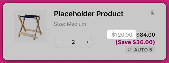
## Show Strikethrough Prices
Enable this setting to show a strikethrough (also known as the [Compare At Price](https://help.shopify.com/en/manual/discounts/sales#set-a-compare-at-price-for-a-product)) price beside each item in the cart. This reflects discounted pricing, similar to your product pages.
 ***
# Colors
## Background Color
Sets the main background color of the cart, excluding the footer and upsell cards.
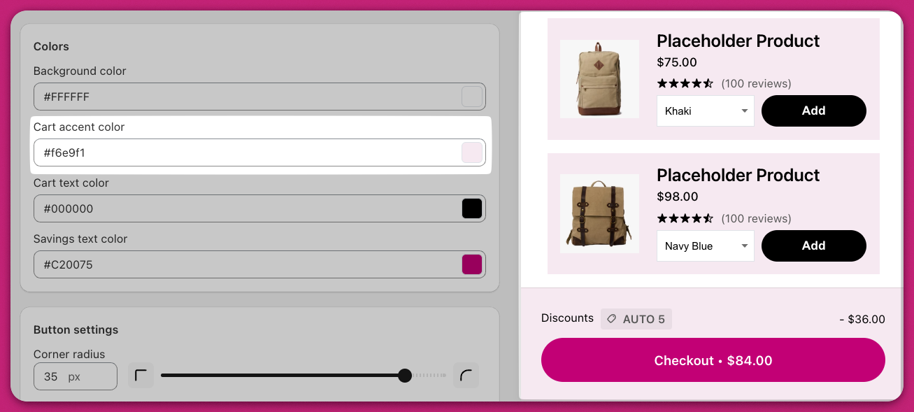
## Cart Accent Color
Controls the background color of the cart footer and upsell item cards.
***
# Colors
## Background Color
Sets the main background color of the cart, excluding the footer and upsell cards.
## Cart Accent Color
Controls the background color of the cart footer and upsell item cards.
 ## Cart Text Color
Defines the color for all cart text, except for button text and savings text, which are controlled separately.
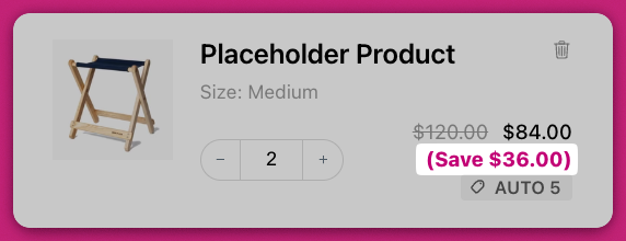
## Savings Text Color
Sets the color of the savings text shown beneath the product price.
## Cart Text Color
Defines the color for all cart text, except for button text and savings text, which are controlled separately.
## Savings Text Color
Sets the color of the savings text shown beneath the product price.
 ## 🚧 **Cart Preview** 🚧
The preview editor may not reflect final styling precisely. Your store's theme may include custom CSS that affects text size or color. Always verify changes on your live storefront.
***
# Button Settings
Upcart offers advanced button styling options, including specific customization for the checkout button. This includes methods for CSS adjustments and integrating Shopify's branding tools.
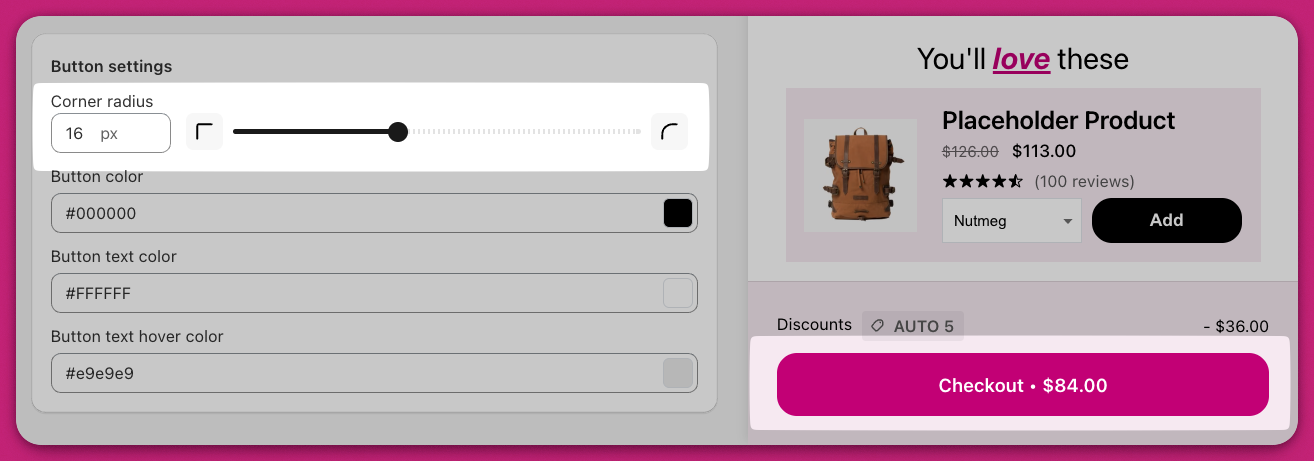
## Corner Radius
Adjusts the roundness of button corners. For example:
* 0 pixels creates square buttons
* Higher values create more rounded or pill-shaped buttons For instance, setting a radius value of `0` creates sharp, square corners, while increasing the radius to `9999px` results in pill-shaped buttons.
## 🚧 **Cart Preview** 🚧
The preview editor may not reflect final styling precisely. Your store's theme may include custom CSS that affects text size or color. Always verify changes on your live storefront.
***
# Button Settings
Upcart offers advanced button styling options, including specific customization for the checkout button. This includes methods for CSS adjustments and integrating Shopify's branding tools.
## Corner Radius
Adjusts the roundness of button corners. For example:
* 0 pixels creates square buttons
* Higher values create more rounded or pill-shaped buttons For instance, setting a radius value of `0` creates sharp, square corners, while increasing the radius to `9999px` results in pill-shaped buttons.
 ## Button Color
Sets the background color for all buttons in the cart, including:
* Checkout button
* Upsell "Add to Cart" button
* Discount "Apply" button
* Subscription upgrade button You can customize these buttons' color through the Cart Editor. For further advanced customizations like CSS modifications, refer to the advanced customization section.
## Button Text Color
Specifies the text color used in all cart buttons.
## Button Text Hover Color
Controls the color of button text when a customer hovers over it with their mouse. For example, if set to green, the text will turn green on hover.
# Advanced CSS Customization for Checkout Buttons
For significant design changes, you can use Custom CSS code to modify the checkout button:
1. Access `Settings > Custom CSS` in your Upcart dashboard.
2. Utilize the relevant CSS selector, such as `.checkout`. Example CSS snippets: To create a pill-shaped button:
```text theme={"theme":{"light":"snazzy-light","dark":"github-dark"}}
.checkout { border-radius: 9999px !important;}
```
To add a black border:
```text theme={"theme":{"light":"snazzy-light","dark":"github-dark"}}
.checkout { border: 2px solid black !important;}
```
Replace `.checkout` with the actual CSS class for your button. Additional styling includes hover effects, padding, text colors, or fonts.
# Integrating Shopify Branding for Button Customization
If you're using Shopify, you can update your checkout button design via Shopify's admin:
1. Log in to your Shopify Admin.
2. Navigate to `Settings > Checkout > Customize`.
3. Utilize branding options to modify the font, roundness, or colour for a seamless design.
## Button Color
Sets the background color for all buttons in the cart, including:
* Checkout button
* Upsell "Add to Cart" button
* Discount "Apply" button
* Subscription upgrade button You can customize these buttons' color through the Cart Editor. For further advanced customizations like CSS modifications, refer to the advanced customization section.
## Button Text Color
Specifies the text color used in all cart buttons.
## Button Text Hover Color
Controls the color of button text when a customer hovers over it with their mouse. For example, if set to green, the text will turn green on hover.
# Advanced CSS Customization for Checkout Buttons
For significant design changes, you can use Custom CSS code to modify the checkout button:
1. Access `Settings > Custom CSS` in your Upcart dashboard.
2. Utilize the relevant CSS selector, such as `.checkout`. Example CSS snippets: To create a pill-shaped button:
```text theme={"theme":{"light":"snazzy-light","dark":"github-dark"}}
.checkout { border-radius: 9999px !important;}
```
To add a black border:
```text theme={"theme":{"light":"snazzy-light","dark":"github-dark"}}
.checkout { border: 2px solid black !important;}
```
Replace `.checkout` with the actual CSS class for your button. Additional styling includes hover effects, padding, text colors, or fonts.
# Integrating Shopify Branding for Button Customization
If you're using Shopify, you can update your checkout button design via Shopify's admin:
1. Log in to your Shopify Admin.
2. Navigate to `Settings > Checkout > Customize`.
3. Utilize branding options to modify the font, roundness, or colour for a seamless design.
