 `cartQuantity`
* **型**: `string`
* **説明**: カート内の現在のアイテム数を文字列形式にしたもの
* **使い方**: カスタムヘッダーのデザインにカートのアイテム数を表示します
```
`cartQuantity`
* **型**: `string`
* **説明**: カート内の現在のアイテム数を文字列形式にしたもの
* **使い方**: カスタムヘッダーのデザインにカートのアイテム数を表示します
```
 `announcementTemplate`
* **型**: `string`
* **説明**: アナウンスメッセージの HTML コンテンツ
* **使い方**: カスタム実装でアナウンスメッセージを表示します
```
```
`timer`
* **型**: `string`
* **説明**: 文字列形式にした現在のタイマー値
* **使い方**: カスタムのアナウンス実装でカウントダウンタイマーを表示します
```
`announcementTemplate`
* **型**: `string`
* **説明**: アナウンスメッセージの HTML コンテンツ
* **使い方**: カスタム実装でアナウンスメッセージを表示します
```
```
`timer`
* **型**: `string`
* **説明**: 文字列形式にした現在のタイマー値
* **使い方**: カスタムのアナウンス実装でカウントダウンタイマーを表示します
```
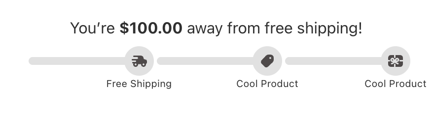 `rewardsMessageHtml`
* **型**: `string`
* **説明**: リワードメッセージの HTML コンテンツ
* **使い方**: カスタム実装でリッチな書式付きのリワードメッセージを表示します
```
```
`milestonesCompleted`
* **型**: `number`
* **説明**: 達成済みのマイルストーンの数
* **使い方**: 達成数の表示や達成率の計算に使用します
```
`rewardsMessageHtml`
* **型**: `string`
* **説明**: リワードメッセージの HTML コンテンツ
* **使い方**: カスタム実装でリッチな書式付きのリワードメッセージを表示します
```
```
`milestonesCompleted`
* **型**: `number`
* **説明**: 達成済みのマイルストーンの数
* **使い方**: 達成数の表示や達成率の計算に使用します
```
 *レコメンデーションタイルテンプレートは、Upsells モジュールの[アップセルタイルテンプレートと同じ prop インターフェース](#available-props-upsell-tile-template)を共有します。利用可能なすべての props、型、使用例は、以下の Upsells モジュールのセクションに記載されています。*
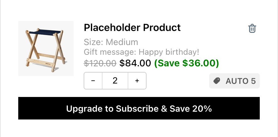 `title`
* **型**: `string`
* **説明**: 商品のタイトル/名前
* **使い方**: カートアイテムにメインの商品名を表示します
`variant`
* **型**: `React.ReactNode`
* **説明**: 事前レンダリングされたバリエーション情報コンポーネント
* **使い方**: バリエーションの詳細を React コンポーネントとして表示します
`properties`
* **型**: `React.ReactNode`
* **説明**: 事前レンダリングされた商品プロパティコンポーネント
* **使い方**: 商品プロパティとサブスクリプション情報を React コンポーネントとして表示します
`bundle`
* **型**: `React.ReactNode`
* **説明**: 事前レンダリングされたバンドル詳細コンポーネント
* **使い方**: バンドル情報を React コンポーネントとして表示します
`compareAtPrice`
* **型**: `string | undefined`
* **説明**: フォーマット済みの割引前価格(元の価格)
* **使い方**: セール商品の元の価格を表示します
`price`
* **型**: `string`
* **説明**: フォーマット済みの現在価格
* **使い方**: アイテムの現在の価格を表示します
`savings`
* **型**: `string | undefined`
* **説明**: フォーマット済みの割引額
* **使い方**: 顧客がどれだけ節約できるかを表示します
`imageUrl`
* **型**: `string | undefined`
* **説明**: 商品画像の URL
* **使い方**: 商品画像を表示します
`productUrl`
* **型**: `string | undefined`
* **説明**: 商品ページの URL
* **使い方**: 商品詳細ページへのリンクに使用します
`quantity`
* **型**: `number`
* **説明**: カート内のアイテムの現在の数量
* **使い方**: アイテムの数量の表示と管理に使用します
`showQuantitySelector`
* **型**: `boolean`
* **説明**: 数量コントロールを表示するかどうか
* **使い方**: 数量セレクターを条件付きで表示します
`discountCodes`
* **型**: `string[] | undefined`
* **説明**: このアイテムに適用されたディスカウントコードの配列
* **使い方**: アイテム固有のディスカウントを表示します
`subscription`
* **型**:
```
{
subscriptionUpgradeData: {
buttonText: string;
defaultSellingPlanId: number;
} | null;
sellingPlansData: {
sellingPlanGroups: {
name: string;
selling_plans: {
id: number;
name: string;
}[];
}[] | null;
activeSellingPlanId: string;
oneTimePurchaseText: string | null;
} | null;
upgradeSellingPlan: (item: CartItem, sellingPlanId: number) => void;
changeSellingPlan: (item: CartItem, value: string) => void;
getSellingPlanGroupText: (groupName: string, planName: string) => string;
}
```
* **説明**: アップグレードデータ、販売プラン、ハンドラー関数を含む完全なサブスクリプション管理オブジェクト
* **使い方**: サブスクリプション機能を管理します
* subscription オブジェクトには次のものが含まれます:
* **subscriptionUpgradeData**: アップグレード情報(アップグレードが利用できない場合は null)
* `buttonText`: アップグレードボタンのテキスト
* `defaultSellingPlanId`: アップグレード用のデフォルト販売プランの ID
* **sellingPlansData**: 利用可能な販売プランのオプション(プランがない場合は null)
* `sellingPlanGroups`: 販売プランを持つプラングループの配列
* `activeSellingPlanId`: 現在選択されている販売プランの ID
* `oneTimePurchaseText`: 1 回限りの購入オプションのテキスト(利用できない場合は null)
* **upgradeSellingPlan**: 特定の販売プランにアップグレードする関数
* **changeSellingPlan**: 現在の販売プランを変更する関数
* **getSellingPlanGroupText**: 販売プランの表示テキストをフォーマットするユーティリティ関数
`onIncrease`
* **型**: `() => void`
* **説明**: アイテムの数量を増やす関数
* **使い方**: 数量増加のアクションを処理します
`onDecrease`
* **型**: `() => void`
* **説明**: アイテムの数量を減らす関数
* **使い方**: 数量減少のアクションを処理します
`onDeleteProduct`
* **型**: `() => void`
* **説明**: アイテムをカートから削除する関数
* **使い方**: アイテムの削除を処理します
`onQuantityChange`
* **型**: `(quantity: string) => void`
* **説明**: 数量の直接入力を処理する関数
* **使い方**: 手動での数量変更を処理します
`handleInputChange`
* **型**: `(e: React.ChangeEvent
`title`
* **型**: `string`
* **説明**: 商品のタイトル/名前
* **使い方**: カートアイテムにメインの商品名を表示します
`variant`
* **型**: `React.ReactNode`
* **説明**: 事前レンダリングされたバリエーション情報コンポーネント
* **使い方**: バリエーションの詳細を React コンポーネントとして表示します
`properties`
* **型**: `React.ReactNode`
* **説明**: 事前レンダリングされた商品プロパティコンポーネント
* **使い方**: 商品プロパティとサブスクリプション情報を React コンポーネントとして表示します
`bundle`
* **型**: `React.ReactNode`
* **説明**: 事前レンダリングされたバンドル詳細コンポーネント
* **使い方**: バンドル情報を React コンポーネントとして表示します
`compareAtPrice`
* **型**: `string | undefined`
* **説明**: フォーマット済みの割引前価格(元の価格)
* **使い方**: セール商品の元の価格を表示します
`price`
* **型**: `string`
* **説明**: フォーマット済みの現在価格
* **使い方**: アイテムの現在の価格を表示します
`savings`
* **型**: `string | undefined`
* **説明**: フォーマット済みの割引額
* **使い方**: 顧客がどれだけ節約できるかを表示します
`imageUrl`
* **型**: `string | undefined`
* **説明**: 商品画像の URL
* **使い方**: 商品画像を表示します
`productUrl`
* **型**: `string | undefined`
* **説明**: 商品ページの URL
* **使い方**: 商品詳細ページへのリンクに使用します
`quantity`
* **型**: `number`
* **説明**: カート内のアイテムの現在の数量
* **使い方**: アイテムの数量の表示と管理に使用します
`showQuantitySelector`
* **型**: `boolean`
* **説明**: 数量コントロールを表示するかどうか
* **使い方**: 数量セレクターを条件付きで表示します
`discountCodes`
* **型**: `string[] | undefined`
* **説明**: このアイテムに適用されたディスカウントコードの配列
* **使い方**: アイテム固有のディスカウントを表示します
`subscription`
* **型**:
```
{
subscriptionUpgradeData: {
buttonText: string;
defaultSellingPlanId: number;
} | null;
sellingPlansData: {
sellingPlanGroups: {
name: string;
selling_plans: {
id: number;
name: string;
}[];
}[] | null;
activeSellingPlanId: string;
oneTimePurchaseText: string | null;
} | null;
upgradeSellingPlan: (item: CartItem, sellingPlanId: number) => void;
changeSellingPlan: (item: CartItem, value: string) => void;
getSellingPlanGroupText: (groupName: string, planName: string) => string;
}
```
* **説明**: アップグレードデータ、販売プラン、ハンドラー関数を含む完全なサブスクリプション管理オブジェクト
* **使い方**: サブスクリプション機能を管理します
* subscription オブジェクトには次のものが含まれます:
* **subscriptionUpgradeData**: アップグレード情報(アップグレードが利用できない場合は null)
* `buttonText`: アップグレードボタンのテキスト
* `defaultSellingPlanId`: アップグレード用のデフォルト販売プランの ID
* **sellingPlansData**: 利用可能な販売プランのオプション(プランがない場合は null)
* `sellingPlanGroups`: 販売プランを持つプラングループの配列
* `activeSellingPlanId`: 現在選択されている販売プランの ID
* `oneTimePurchaseText`: 1 回限りの購入オプションのテキスト(利用できない場合は null)
* **upgradeSellingPlan**: 特定の販売プランにアップグレードする関数
* **changeSellingPlan**: 現在の販売プランを変更する関数
* **getSellingPlanGroupText**: 販売プランの表示テキストをフォーマットするユーティリティ関数
`onIncrease`
* **型**: `() => void`
* **説明**: アイテムの数量を増やす関数
* **使い方**: 数量増加のアクションを処理します
`onDecrease`
* **型**: `() => void`
* **説明**: アイテムの数量を減らす関数
* **使い方**: 数量減少のアクションを処理します
`onDeleteProduct`
* **型**: `() => void`
* **説明**: アイテムをカートから削除する関数
* **使い方**: アイテムの削除を処理します
`onQuantityChange`
* **型**: `(quantity: string) => void`
* **説明**: 数量の直接入力を処理する関数
* **使い方**: 手動での数量変更を処理します
`handleInputChange`
* **型**: `(e: React.ChangeEvent
### **利用可能な props - Variant テンプレート**
 `item`
* **型**: `CartItem`([下記](#cartitem-object-properties)の `CartItem` 型を参照)
* **説明**: バリエーション情報を含む生のカートアイテムデータ
* **使い方**: カートアイテムからバリエーションの詳細にアクセスします
`item`
* **型**: `CartItem`([下記](#cartitem-object-properties)の `CartItem` 型を参照)
* **説明**: バリエーション情報を含む生のカートアイテムデータ
* **使い方**: カートアイテムからバリエーションの詳細にアクセスします
### **利用可能な props - Properties テンプレート**
 `productProperties`
* **型**: `{ key: string; value: string; isUrl?: boolean; }[]`
* **説明**: 商品プロパティの配列(カスタムフィールド、ラインアイテムのプロパティ)
`subscriptionLabel`
* **型**: `string | undefined`
* **説明**: サブスクリプション情報のラベル
`productProperties`
* **型**: `{ key: string; value: string; isUrl?: boolean; }[]`
* **説明**: 商品プロパティの配列(カスタムフィールド、ラインアイテムのプロパティ)
`subscriptionLabel`
* **型**: `string | undefined`
* **説明**: サブスクリプション情報のラベル
### **利用可能な props - Bundle テンプレート**
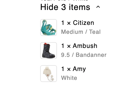 `getSizedImageUrl`
* **型**: `getSizedImageUrl: ({ src, width, height }: SizedImageParams) => string`
* **説明**: 適切なサイズの画像 URL を取得するユーティリティ関数
`item`
* **型**:
```
{
itemComponents: {
quantity: number;
image: {
url: string;
height: number | null;
width: number | null;
alt: string;
};
product: {
title: string;
has_only_default_variant: boolean;
};
variantTitle: string;
}[];
variantTitle: string | undefined;
hasComponents: boolean;
}
```
* **説明**: コンポーネントを含むバンドルアイテムの情報。`itemComponents` はコンポーネントオブジェクトの配列です — map で処理して各バンドルコンポーネントをレンダリングしてください。
`showDetailsText`
* **型**: `string | undefined`
* **説明**: 「詳細を表示」アクションのテキスト
* **使い方**: 展開ボタンのテキストを表示します
`hideDetailsText`
* **型**: `string | undefined`
* **説明**: 「詳細を非表示」アクションのテキスト
`isExpanded`
* **型**: `boolean`
* **説明**: バンドルの詳細が展開されているかどうか
`toggleCollapsible`
* **型**: `() => void`
* **説明**: バンドル詳細の表示を切り替える関数
* **使い方**: 展開/折りたたみのアクションを処理します
`chevronDownIconComponent`
* **型**: `React.ReactElement`
* **説明**: 展開/折りたたみ用の事前レンダリングされたシェブロンアイコン
* **使い方**: 一貫性のある展開/折りたたみインジケーターを表示します
`getSizedImageUrl`
* **型**: `getSizedImageUrl: ({ src, width, height }: SizedImageParams) => string`
* **説明**: 適切なサイズの画像 URL を取得するユーティリティ関数
`item`
* **型**:
```
{
itemComponents: {
quantity: number;
image: {
url: string;
height: number | null;
width: number | null;
alt: string;
};
product: {
title: string;
has_only_default_variant: boolean;
};
variantTitle: string;
}[];
variantTitle: string | undefined;
hasComponents: boolean;
}
```
* **説明**: コンポーネントを含むバンドルアイテムの情報。`itemComponents` はコンポーネントオブジェクトの配列です — map で処理して各バンドルコンポーネントをレンダリングしてください。
`showDetailsText`
* **型**: `string | undefined`
* **説明**: 「詳細を表示」アクションのテキスト
* **使い方**: 展開ボタンのテキストを表示します
`hideDetailsText`
* **型**: `string | undefined`
* **説明**: 「詳細を非表示」アクションのテキスト
`isExpanded`
* **型**: `boolean`
* **説明**: バンドルの詳細が展開されているかどうか
`toggleCollapsible`
* **型**: `() => void`
* **説明**: バンドル詳細の表示を切り替える関数
* **使い方**: 展開/折りたたみのアクションを処理します
`chevronDownIconComponent`
* **型**: `React.ReactElement`
* **説明**: 展開/折りたたみ用の事前レンダリングされたシェブロンアイコン
* **使い方**: 一貫性のある展開/折りたたみインジケーターを表示します
### **利用可能な props - Price テンプレート**
 `compareAtPrice`
* **型**: `string | undefined`
* **説明**: フォーマット済みの割引前価格(元の価格)
* **使い方**: セール商品の元の価格を表示します
`price`
* **型**: `string`
* **説明**: フォーマット済みの現在価格
* **使い方**: アイテムの現在の価格を表示します
`savings`
* **型**: `string | undefined`
* **説明**: フォーマット済みの割引額
* **使い方**: 顧客がどれだけ節約できるかを表示します
`compareAtPrice`
* **型**: `string | undefined`
* **説明**: フォーマット済みの割引前価格(元の価格)
* **使い方**: セール商品の元の価格を表示します
`price`
* **型**: `string`
* **説明**: フォーマット済みの現在価格
* **使い方**: アイテムの現在の価格を表示します
`savings`
* **型**: `string | undefined`
* **説明**: フォーマット済みの割引額
* **使い方**: 顧客がどれだけ節約できるかを表示します
### **CartItem オブジェクトのプロパティ**
`CartItem` オブジェクトには、カートのラインアイテムに関するすべての詳細情報が含まれています。このオブジェクトは、Product Tile テンプレートでは props.rawItem として、Variant テンプレートでは props.item として利用できます。
#### **コア識別情報**
* `key (string)` - このカートアイテムの一意の識別子。
* `id (number)` - バリエーション ID(レガシーフィールド、代わりに variant\_id を使用してください)
* `variant_id (number)` - このアイテムの Shopify バリエーション ID
* `product_id (number)` - Shopify 商品 ID
* `lineIdxFrom1 (number)` - 変更前の元のカートにおける、このアイテムの 1 始まりのインデックス
#### **商品情報**
* `title (string)` - ラインアイテムのタイトル(通常はバリエーションのタイトル)
* `product_title (string)` - メインの商品タイトル
* `handle (string)` - 商品 URL のハンドル(例: 「camp-stool」)
* `vendor (string)` - 商品の販売元/ブランド名
* `product_type (string)` - 税務目的の商品カテゴリー/タイプ
* `sku (string)` - SKU(在庫管理単位)識別子
* `product_description (string)` - 商品の完全な説明
* `product_has_only_default_variant (boolean)` - 商品にバリエーションが 1 つしかないかどうか
#### **価格(すべての価格はセント単位)**
* `quantity (number)` - カート内のこのアイテムの数
* `price (number)` - ディスカウント前の単価
* `original_price (number)` - price と同じ
* `discounted_price (number)` - 商品レベルのディスカウント後の単価
* `compare_at_price (number | null)` - 割引前価格(MSRP)。注: このフィールドは Upcart によって追加されるもので、Shopify のカート API では提供されません
* `final_line_price (number)` - 商品レベルのディスカウント後の合計価格(quantity × discounted\_price)
* `original_line_price (number)` - ディスカウント前の合計価格(quantity × price)
* `line_price (number)` - すべてのディスカウント後の合計価格
* `final_price (number)` - **非推奨** - 商品ディスカウント後の単価(数量は考慮されません)
* `total_discount (number)` - line\_level\_total\_discount と同じ
* `line_level_total_discount (number)` - このラインアイテムに適用されたディスカウントの合計額
#### **メディアと URL**
* `image (string)` - メインの商品画像 URL
* `url (string)` - 商品ページへの相対 URL パス(例: 「/products/camp-stool?variant=42789611372803」)
* `featured_image (object | null)` - フィーチャー画像の詳細:
* `alt (string)` - 画像の代替テキスト
* `aspect_ratio (number)` - 画像のアスペクト比
* `height (number)` - 画像の高さ(ピクセル)
* `url (string)` - 画像 URL
* `width (number)` - 画像の幅(ピクセル)
#### **バリエーションとオプション**
* `variant_title (string | null)` - バリエーションのタイトル(例: 「Large / Red」)
* `variant_options (string[])` - バリエーションオプション値の配列
* `options_with_values (Array)` - 詳細なオプション情報:
* `name (string)` - オプション名(例: 「Size」)
* `value (string)` - オプション値(例: 「Large」)
* `untranslated_product_title (string | undefined)` - 翻訳前の元の商品タイトル(カート変更レスポンスのみ)
* `untranslated_variant_title (string | undefined)` - 翻訳前の元のバリエーションタイトル(カート変更レスポンスのみ)
#### **カスタムプロパティとメタデータ**
* `properties (Record
#### **ディスカウントとプロモーション**
* `discounts (Array)` - 簡略化されたディスカウント情報:
* `amount (number)` - ディスカウント額(セント単位)
* `title (string)` - ディスカウントのタイトル/名前
* `line_level_discount_allocations (Array)` - 詳細なディスカウント割り当て情報:
* `amount (number)` - ディスカウント額(セント単位)
* `discount_application (object)` - ディスカウント適用の完全な詳細:
* `allocation_method (string)` - ディスカウントの割り当て方法
* `created_at (string)` - ディスカウントの作成日時
* `description (string | null)` - ディスカウントの説明
* `key (string)` - ディスカウントのキー識別子
* `target_selection (string)` - ディスカウントの対象の選択方法
* `target_type (string)` - 対象のタイプ
* `title (string)` - ディスカウントのタイトル
* `total_allocated_amount (number)` - 割り当てられた合計額
* `type ('discount_code' | '')` - ディスカウントのタイプ(自動ディスカウントの場合は空文字列)
* `value (string)` - ディスカウントの値
* `value_type (string)` - 値の適用方法
#### **バンドル商品**
* `has_components (boolean | undefined)` - このアイテムが他の商品を含むバンドルかどうか(GET カートレスポンスのみ)
* `item_components (Array | null | undefined)` - バンドルコンポーネントの詳細:
* `quantity (number)` - このコンポーネントの数量
* `image (object)` - コンポーネントの画像:
* `url (string)` - 画像 URL
* `height (number | null)` - 画像の高さ
* `width (number | null)` - 画像の幅
* `alt (string)` - 代替テキスト
* `product (object)` - コンポーネントの商品情報:
* `title (string)` - 商品タイトル
* `has_only_default_variant (boolean)` - 商品にデフォルトのバリエーションしかないかどうか
* `variantTitle (string)` - コンポーネントのバリエーションタイトル
#### **ビジネスルール**
* `quantity_rule (object | undefined)` - 数量の制約(GET カートレスポンスのみ):
* `min (number)` - 許可される最小数量
* `max (number | null)` - 許可される最大数量(null = 制限なし)
* `increment (number)` - 数量の増分ステップ
#### **サブスクリプション情報**
* `selling_plan_allocation (object | undefined)` - サブスクリプション/販売プランの詳細:
* `price (number)` - サブスクリプション価格(セント単位)
* `compare_at_price (number | null)` - サブスクリプションの割引前価格
* `per_delivery_price (number)` - 配送 1 回あたりの価格
* `selling_plan (object)` - 販売プランの詳細:
* `id (number)` - 販売プラン ID
* `name (string)` - プラン名
* `description (string)` - プランの説明
* `options (Array)` - プランのオプション:
* `name (string)` - オプション名
* `position (number)` - オプションの位置
* `value (string)` - オプション値
* `recurring_deliveries (boolean)` - プランに定期配送があるかどうか
#### **統合メタデータ**
* `__appIntegrated (object | undefined)` - サードパーティアプリの統合データ:
* `app ('stay.ai')` - 統合されたアプリの識別子
* `bundleRole ('parent' | 'child')` - バンドル構造における役割
## アップセル
Upsells モジュールを使用すると、バリエーションの選択、カート追加アクション、商品情報の表示といった E コマースの基本機能を維持しながら、独自のデザインでアップセル商品の表示をカスタマイズできます。
### **利用可能な props - Upsell タイルテンプレート**
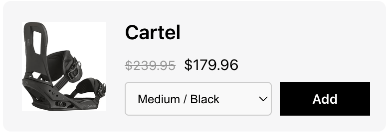 `itemUrl`
* **型**: `string`
* **説明**: 商品ページの URL
* **使い方**: ユーザーナビゲーションを向上させるために、商品詳細ページへのリンクを作成します
```
`itemUrl`
* **型**: `string`
* **説明**: 商品ページの URL
* **使い方**: ユーザーナビゲーションを向上させるために、商品詳細ページへのリンクを作成します
```
{props.productTitle}
## 追加メモ
Notes モジュールを使用すると、展開可能なセクション、テキスト入力の処理、ローディング状態といったメモの基本機能を維持しながら、独自のデザインでカートメモ機能をカスタマイズできます。
### **利用可能な props - Full テンプレート**
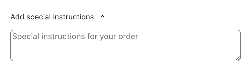 `cartNote`
* **型**: `string`
* **説明**: 顧客が入力した現在のカートメモの内容
* **使い方**: カスタム実装でカートメモのテキストを表示および管理します
```
```
`notesPlaceholder`
* **型**: `string`
* **説明**: メモ入力フィールドのプレースホルダーテキスト
* **使い方**: メモに何を含めるべきかについて顧客にガイダンスを提供します
```
```
`notesTitle`
* **型**: `string`
* **説明**: メモセクションのタイトル/ヘッダーテキスト
* **使い方**: カスタムのメモ実装でセクションタイトルを表示します
```
```
`chevronDownIconComponent`
* **型**: `React.ReactElement`
* **説明**: 展開/折りたたみ機能用の事前レンダリングされたシェブロンアイコンコンポーネント
* **使い方**: カスタム実装で一貫性のある展開/折りたたみインジケーターを表示します
`loadingIndicatorComponent`
* **型**: `React.ReactElement | null`
* **説明**: 非同期操作用の事前レンダリングされたローディングインジケーターコンポーネント
* **使い方**: メモの保存操作中にローディング状態を表示します
`handleCartNoteChange`
* **型**: `(newCartNote: string) => void`
* **説明**: カートメモの内容変更を処理する関数
* **使い方**: ユーザーがテキストを変更したときにカートメモを更新します
`isExpanded`
* **型**: `boolean`
* **説明**: メモセクションが現在展開されているかどうかを示します
* **使い方**: メモ入力エリアの表示を制御します
`toggleCollapsible`
* **型**: `() => void`
* **説明**: メモセクションの展開/折りたたみ状態を切り替える関数
* **使い方**: セクションの表示を制御するために、ボタンやインタラクティブ要素にアタッチします
***
`cartNote`
* **型**: `string`
* **説明**: 顧客が入力した現在のカートメモの内容
* **使い方**: カスタム実装でカートメモのテキストを表示および管理します
```
```
`notesPlaceholder`
* **型**: `string`
* **説明**: メモ入力フィールドのプレースホルダーテキスト
* **使い方**: メモに何を含めるべきかについて顧客にガイダンスを提供します
```
```
`notesTitle`
* **型**: `string`
* **説明**: メモセクションのタイトル/ヘッダーテキスト
* **使い方**: カスタムのメモ実装でセクションタイトルを表示します
```
```
`chevronDownIconComponent`
* **型**: `React.ReactElement`
* **説明**: 展開/折りたたみ機能用の事前レンダリングされたシェブロンアイコンコンポーネント
* **使い方**: カスタム実装で一貫性のある展開/折りたたみインジケーターを表示します
`loadingIndicatorComponent`
* **型**: `React.ReactElement | null`
* **説明**: 非同期操作用の事前レンダリングされたローディングインジケーターコンポーネント
* **使い方**: メモの保存操作中にローディング状態を表示します
`handleCartNoteChange`
* **型**: `(newCartNote: string) => void`
* **説明**: カートメモの内容変更を処理する関数
* **使い方**: ユーザーがテキストを変更したときにカートメモを更新します
`isExpanded`
* **型**: `boolean`
* **説明**: メモセクションが現在展開されているかどうかを示します
* **使い方**: メモ入力エリアの表示を制御します
`toggleCollapsible`
* **型**: `() => void`
* **説明**: メモセクションの展開/折りたたみ状態を切り替える関数
* **使い方**: セクションの表示を制御するために、ボタンやインタラクティブ要素にアタッチします
***
## アドオン
Addons モジュールを使用すると、商品情報の表示、価格設定、トグルコントロール、通貨のフォーマットといった E コマースの基本機能を維持しながら、独自のデザインでアドオン商品の表示をカスタマイズできます。
### **利用可能な props - Full テンプレート**
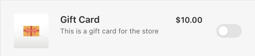 `addonProduct`
* **型**:
```
{
product: {
id: number;
title: string;
description: string;
};
variant: {
id: number;
price: number;
compare_at_price: number | null;
};
image: {
src: string;
alt: string;
};
}
```
* **説明**: 商品の詳細、バリエーションの価格、画像データを含む、アドオン商品の完全な情報
* **使い方**: アドオン商品の表示に必要なすべての商品情報にアクセスします
* **構造**: 包括的な商品データを持つ、ネストされた product、variant、image オブジェクトが含まれます
* **Product オブジェクトのプロパティ** `addonProduct.product`
* **id**: 商品の一意の数値識別子
* **title**: アドオン商品の表示名
* **description**: 商品の HTML 形式の説明コンテンツ
* **Variant オブジェクトのプロパティ**
* **id**: バリエーションの一意の数値識別子
* **price**: 現在の価格(セント単位)
* **compare\_at\_price**: 元の価格(セント単位、比較価格がない場合は null)
* **Image オブジェクトのプロパティ**
* **src**: 商品画像の URL
* **alt**: 画像の代替テキスト(アクセシビリティ用)
`toggle`
* **型**:
```
{
state: 'enabled' | 'disabled' | 'loading';
handleEnable: () => void;
handleDisable: () => void;
} | null
```
* **説明**: アドオンの有効化/無効化のためのトグルコントロールの状態とハンドラー
* **使い方**: アドオン選択のためのインタラクティブなトグル機能を実装します
* **状態**: enabled、disabled、loading の 3 つの状態があります
* **ハンドラー**: 有効化と無効化のアクションごとに個別の関数があります
`moneyFormat`
* **型**: `string`
* **説明**: 価格のフォーマットに使用される通貨フォーマット文字列
* **使い方**: 一貫した通貨表示のために formatMoney 関数に渡します
`formatMoney`
* **型**:
```
(options: {
cents: string | number;
format?: string;
shouldRemoveHTML?: boolean;
}) => string
```
* **説明**: 通貨の値をフォーマットするユーティリティ関数
* **使い方**: ストアの通貨設定に沿って価格を一貫してフォーマットします
* **パラメーター**: セント単位の値、オプションのフォーマット文字列、HTML 除去オプションを受け取ります
`addonProduct`
* **型**:
```
{
product: {
id: number;
title: string;
description: string;
};
variant: {
id: number;
price: number;
compare_at_price: number | null;
};
image: {
src: string;
alt: string;
};
}
```
* **説明**: 商品の詳細、バリエーションの価格、画像データを含む、アドオン商品の完全な情報
* **使い方**: アドオン商品の表示に必要なすべての商品情報にアクセスします
* **構造**: 包括的な商品データを持つ、ネストされた product、variant、image オブジェクトが含まれます
* **Product オブジェクトのプロパティ** `addonProduct.product`
* **id**: 商品の一意の数値識別子
* **title**: アドオン商品の表示名
* **description**: 商品の HTML 形式の説明コンテンツ
* **Variant オブジェクトのプロパティ**
* **id**: バリエーションの一意の数値識別子
* **price**: 現在の価格(セント単位)
* **compare\_at\_price**: 元の価格(セント単位、比較価格がない場合は null)
* **Image オブジェクトのプロパティ**
* **src**: 商品画像の URL
* **alt**: 画像の代替テキスト(アクセシビリティ用)
`toggle`
* **型**:
```
{
state: 'enabled' | 'disabled' | 'loading';
handleEnable: () => void;
handleDisable: () => void;
} | null
```
* **説明**: アドオンの有効化/無効化のためのトグルコントロールの状態とハンドラー
* **使い方**: アドオン選択のためのインタラクティブなトグル機能を実装します
* **状態**: enabled、disabled、loading の 3 つの状態があります
* **ハンドラー**: 有効化と無効化のアクションごとに個別の関数があります
`moneyFormat`
* **型**: `string`
* **説明**: 価格のフォーマットに使用される通貨フォーマット文字列
* **使い方**: 一貫した通貨表示のために formatMoney 関数に渡します
`formatMoney`
* **型**:
```
(options: {
cents: string | number;
format?: string;
shouldRemoveHTML?: boolean;
}) => string
```
* **説明**: 通貨の値をフォーマットするユーティリティ関数
* **使い方**: ストアの通貨設定に沿って価格を一貫してフォーマットします
* **パラメーター**: セント単位の値、オプションのフォーマット文字列、HTML 除去オプションを受け取ります
## ディスカウントコード
Discount Code モジュールを使用すると、コードの検証、フォーム送信、ユーザーへのフィードバックといった E コマースの基本機能を維持しながら、独自のデザインでディスカウントコード入力機能をカスタマイズできます。
### **利用可能な props - Full テンプレート**
 `indicator`
* **型**: `'validating' | 'invalid' | 'none'`
* **説明**: ディスカウントコード入力の現在の検証状態
* **使い方**: 検証状態に基づいて適切な UI フィードバックを表示します
* **状態**:
* `validating`: コードが処理/検証中
* `invalid`: コードの検証に失敗
* `none`: 検証状態なし(デフォルト/アイドル)
`discountCodeInput`
* **型**: `string`
* **説明**: ディスカウントコード入力フィールドの現在の値
* **使い方**: ユーザーが入力したディスカウントコードのテキストを表示および管理します
```
props.setDiscountCodeInput(e.target.value)}
...
/>
```
`discountCodePlaceholder`
* **型**: `string`
* **説明**: ディスカウントコード入力フィールドのプレースホルダーテキスト
* **使い方**: 入力欄に何を入力すべきかについてユーザーにガイダンスを提供します
`discountCodeButtonText`
* **型**: `string`
* **説明**: 適用/送信ボタンに表示するテキスト
* **使い方**: ディスカウントコード送信用のボタンテキストをカスタマイズします
`setDiscountCodeInput`
* **型**: `(value: string | ((prev: string) => string)) => void`
* **説明**: ディスカウントコードの入力値を更新する関数
* **使い方**: ディスカウントコードフィールドでのユーザー入力の変更を処理します
`handleSubmit`
* **型**: `(e: React.FormEvent
`indicator`
* **型**: `'validating' | 'invalid' | 'none'`
* **説明**: ディスカウントコード入力の現在の検証状態
* **使い方**: 検証状態に基づいて適切な UI フィードバックを表示します
* **状態**:
* `validating`: コードが処理/検証中
* `invalid`: コードの検証に失敗
* `none`: 検証状態なし(デフォルト/アイドル)
`discountCodeInput`
* **型**: `string`
* **説明**: ディスカウントコード入力フィールドの現在の値
* **使い方**: ユーザーが入力したディスカウントコードのテキストを表示および管理します
```
props.setDiscountCodeInput(e.target.value)}
...
/>
```
`discountCodePlaceholder`
* **型**: `string`
* **説明**: ディスカウントコード入力フィールドのプレースホルダーテキスト
* **使い方**: 入力欄に何を入力すべきかについてユーザーにガイダンスを提供します
`discountCodeButtonText`
* **型**: `string`
* **説明**: 適用/送信ボタンに表示するテキスト
* **使い方**: ディスカウントコード送信用のボタンテキストをカスタマイズします
`setDiscountCodeInput`
* **型**: `(value: string | ((prev: string) => string)) => void`
* **説明**: ディスカウントコードの入力値を更新する関数
* **使い方**: ディスカウントコードフィールドでのユーザー入力の変更を処理します
`handleSubmit`
* **型**: `(e: React.FormEvent
## カートサマリー
Cart Summary モジュールを使用すると、ディスカウント管理、割引額の計算、価格の透明性といった E コマースの基本機能を維持しながら、独自のデザインでカートサマリーとディスカウントの表示をカスタマイズできます。
### **利用可能な props - Full テンプレート**
 `totalSavingsText`
* **型**: `string`
* **説明**: 合計割引額セクションのテキストラベル
* **使い方**: カスタムのカートサマリー実装で割引額のラベルを表示します
`discountApplications`
* **型**:
```
{
key: string;
title: string;
type: 'discount_code' | '';
}[]
```
* **説明**: 適用されたディスカウントコードと自動ディスカウントの配列
* **使い方**: すべての有効なディスカウントをタイトルとタイプとともに表示します
* **構造**: 各ディスカウントには、一意のキー、表示タイトル、タイプ識別子が含まれます
`cartTotalDiscount`
* **型**: `number`
* **説明**: ディスカウントの合計額(セント単位)
* **使い方**: 計算やカスタムフォーマットのために生のディスカウント値にアクセスします
`showCartTotalDiscount`
* **型**: `boolean`
* **説明**: ディスカウントの合計を表示すべきかどうかを示します。`showTotalSavings` を推奨として非推奨マークが付いていますが、下記の注記を参照してください — カスタムテンプレート内では、依然としてこれが利用できる prop です。
* **使い方**: 設定に基づいてディスカウント情報を条件付きでレンダリングします
`formattedCartTotalDiscount`
* **型**: `string`
* **説明**: ディスカウント合計額の事前フォーマット済み HTML 文字列。`formattedTotalSavings` を推奨として非推奨マークが付いていますが、下記の注記を参照してください。
* **使い方**: 通貨記号付きの適切にフォーマットされたディスカウント額を表示します
`totalSavingsText`
* **型**: `string`
* **説明**: 合計割引額セクションのテキストラベル
* **使い方**: カスタムのカートサマリー実装で割引額のラベルを表示します
`discountApplications`
* **型**:
```
{
key: string;
title: string;
type: 'discount_code' | '';
}[]
```
* **説明**: 適用されたディスカウントコードと自動ディスカウントの配列
* **使い方**: すべての有効なディスカウントをタイトルとタイプとともに表示します
* **構造**: 各ディスカウントには、一意のキー、表示タイトル、タイプ識別子が含まれます
`cartTotalDiscount`
* **型**: `number`
* **説明**: ディスカウントの合計額(セント単位)
* **使い方**: 計算やカスタムフォーマットのために生のディスカウント値にアクセスします
`showCartTotalDiscount`
* **型**: `boolean`
* **説明**: ディスカウントの合計を表示すべきかどうかを示します。`showTotalSavings` を推奨として非推奨マークが付いていますが、下記の注記を参照してください — カスタムテンプレート内では、依然としてこれが利用できる prop です。
* **使い方**: 設定に基づいてディスカウント情報を条件付きでレンダリングします
`formattedCartTotalDiscount`
* **型**: `string`
* **説明**: ディスカウント合計額の事前フォーマット済み HTML 文字列。`formattedTotalSavings` を推奨として非推奨マークが付いていますが、下記の注記を参照してください。
* **使い方**: 通貨記号付きの適切にフォーマットされたディスカウント額を表示します
## トラストバッジ
Trust Badges モジュールを使用すると、条件付きのバッジ表示や適切な画像処理といった信頼構築の基本機能を維持しながら、独自のデザインでトラストバッジの表示をカスタマイズできます。
### **利用可能な props - Full テンプレート**
`showBadge`
* **型**: `boolean`
* **説明**: トラストバッジを表示すべきかどうかを示します
* **使い方**: モジュール設定に基づいてトラストバッジの表示を制御します
`badgeUrl`
* **型**: `string`
* **説明**: 表示するトラストバッジ画像の URL
* **使い方**: カスタム実装におけるトラストバッジ画像のソース URL