> ## Documentation Index
> Fetch the complete documentation index at: https://docs.aftersell.com/llms.txt
> Use this file to discover all available pages before exploring further.
# チェックアウトブランディング設定
> この記事では、Checkout Branding 設定の内容と、各セクションを使ってチェックアウトをカスタマイズする方法を説明します。
ブランディング設定を使うと、色やタイポグラフィからボタン、フォームフィールド、ページレイアウトまで、チェックアウトのルック&フィールをカスタマイズできます。これらのツールにより、チェックアウトのデザインをブランドアイデンティティに簡単に合わせられます。
# アクセス方法
Aftersell で **Checkout** ダッシュボードを開き、ページ上部の **Edit branding** をクリックします。
ここでのブランディング編集には **Shopify Plus** プランが必要です。Shopify がアプリによるチェックアウトブランディングの読み書きを許可しているのは Plus のみのため、他のプランではこれらの設定を保存できません。ストアが Plus でない場合は、代わりに Shopify チェックアウトエディターで同じ変更を行ってください: Shopify 管理画面の**設定 → チェックアウト → カスタマイズ**。
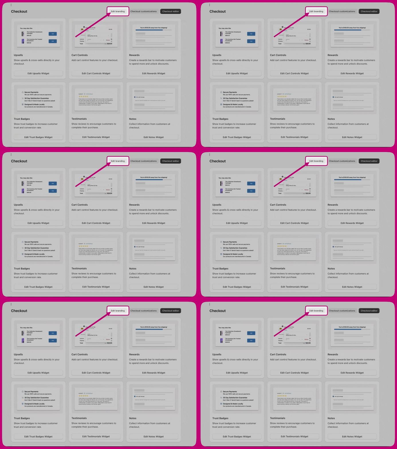 エディターは 3 つのグループで構成されています: **Design system**、**Customizations**、**Advanced**。
***
エディターは 3 つのグループで構成されています: **Design system**、**Customizations**、**Advanced**。
***
# Design system
Design system の設定は土台です。より具体的な設定で上書きされない限り、チェックアウト全体のコンポーネントはここから継承します。
## Global colors
ストアと購入後体験の全体で使われる、ブランドカラーとシステムカラーです。カラースキームが設定されていない場合、コンポーネントはこれらの色を使用します。
**ブランドカラー**
* **Brand** – プライマリブランドカラー。
* **Accent** – インタラクティブな要素やハイライト要素に使用。
* **Decorative** – 補助的な装飾要素に使用。
**ステータスとシステムカラー**
* **Success** – 確認完了の状態。
* **Warning** – 注意喚起のメッセージ。
* **Critical** – エラーとアラート。
* **Info** – 情報メッセージ。
サーフェスとボタンの色はここでは設定しません。**Advanced > Color schemes** にあります。
## タイポグラフィ
* **Font size** – **Base size** と、そこから残りのタイプスケールを導出する **Scale ratio** を設定します。
* **Primary font** – 通常のテキスト、ボタン、フォームコントロールなど、ほとんどのコンポーネントに使用されます。**Font family**、**Base weight**、**Bold weight** を選択します。
* **Secondary font** – 見出しコンポーネントに使用され、同じ 3 つのコントロールがあります。
## 角の丸み
ボタン、フォームフィールド、コンテナなどのコンポーネントが参照する共通の角丸の値を設定します。**Small**、**Medium**、**Large** の 3 サイズを定義します。
***
# Customizations
## ボタン
**Primary buttons**(ページのメインアクション)と **Secondary buttons**(補助アクション)で個別に設定します。それぞれに以下があります。
* **Corner radius** – Small、Medium、Large、または None(角ばった形)。
* **Background** – Solid または None。
* **Vertical padding** と **Horizontal padding**。
* **Show border**。
ボタンの色はカラースキームから継承されます。スキームの値が設定されていない場合はグローバルカラーが使われます。
## フォームフィールド
サポートされるすべてのフィールドタイプに適用されます。
* **Corner radius**
* **Label position** – Inside または Outside。
* **Show border**
**フィールド固有のオーバーライド**により、特定のフィールドタイプで共通スタイルから逸脱できます: **Text field borders**、**Dropdown borders**、**Choice list group spacing**、**Checkbox corner radius**。
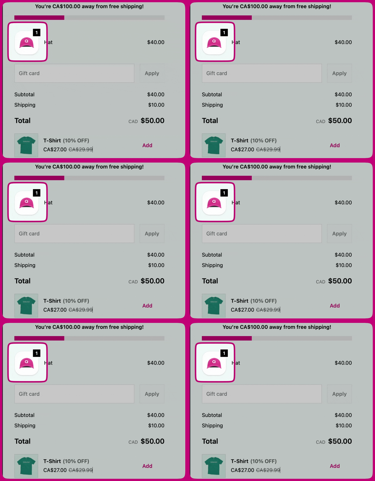
## 商品サムネイル
ページ上での商品画像の表示方法を制御します。
* **Show border**
* **Border radius**
* **Fit**
* **Badge background color** – Accent(スキームのアクセントカラー)または Base(スキームのベースカラー)。
* **Layout** – **Placement**(Top bar、Left section、Right section)と **Alignment**(Left、Center、Right)。
* **Container** – **Padding**、**Color scheme**、**Show divider**。
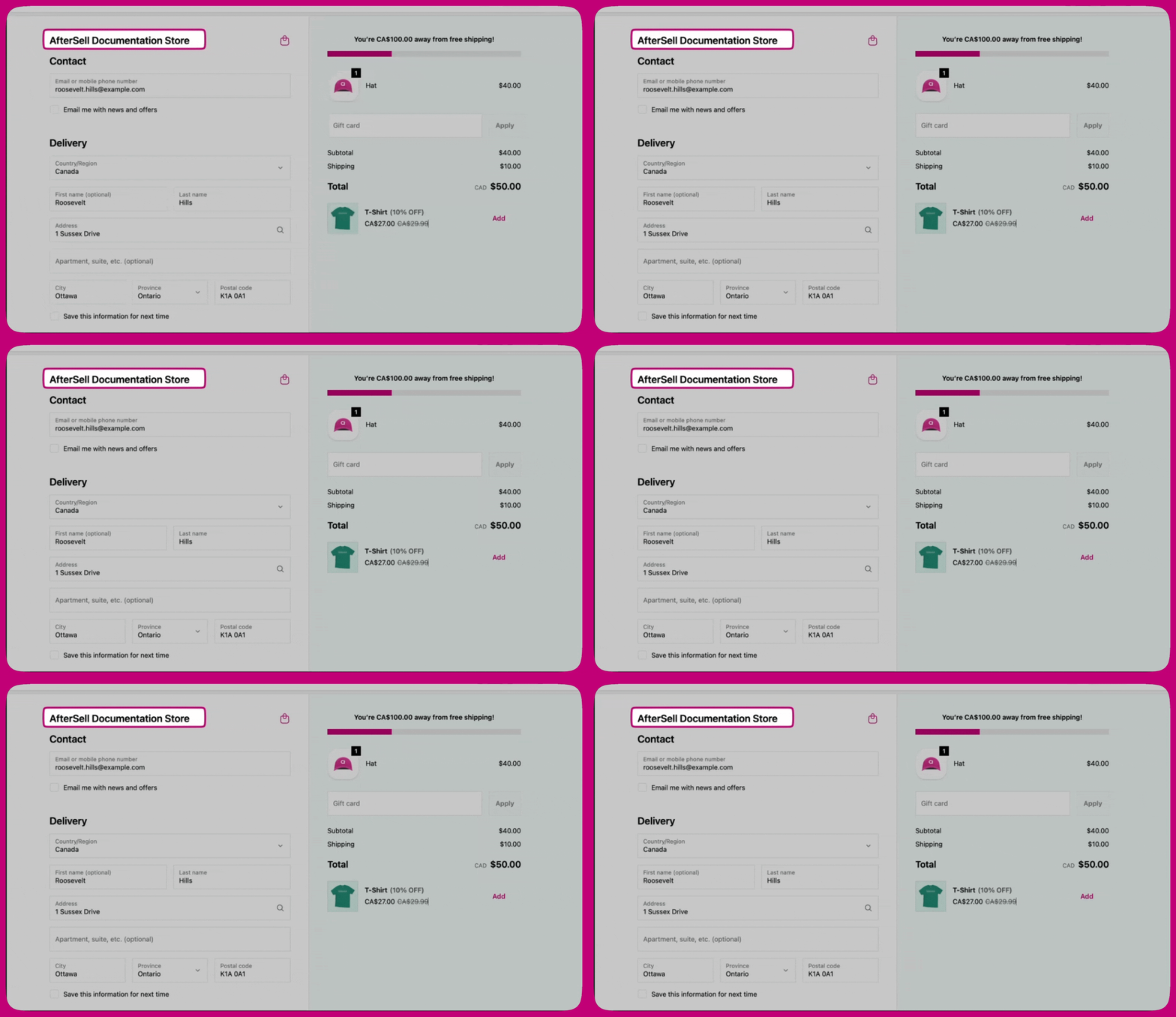
## コンテンツエリア
メインエリアと注文サマリーエリアの間の**区切り線**を制御します: **Show divider**、**Border style**、**Border weight**。
## メインエリア
* **Section containers** – 各セクションを囲む背景とボーダー: **Background**、**Show border**、**Border style**、**Border weight**。
* **Section dividers** – セクション間に表示される線。
## 注文サマリー
* **Container** – 注文サマリーコンテナ全体に適用される **Color scheme**。
* **Section dividers** – **Show divider**、**Border style**、**Border weight**。
* **Section containers** – 各セクションの背景とボーダー: **Show border**、**Background**、**Border style**、**Border weight**、**Color scheme**、**Corner radius**、**Padding**、**Shadow**。
 * **Layout** – **Placement** と **Alignment**。
* **Container** – **Show footer content**、**Padding**、**Color scheme**、**Show divider**。
***
* **Layout** – **Placement** と **Alignment**。
* **Container** – **Show footer content**、**Padding**、**Color scheme**、**Show divider**。
***
# Advanced
## カラースキーム
カラースキームは、他のセクションが参照する、サーフェス・テキスト・ボタンの色の再利用可能なセットです。2 つのスキームが利用できます。
* **Scheme 1 - Main area**
* **Scheme 2 - Supporting areas**
各スキームは 3 つのグループに分かれています。
* **Buttons** – メインの支払いボタンと補助アクションに使用。**Primary button** と **Secondary button** は個別に設定し、それぞれにデフォルト状態とホバー状態があります。
* **Form controls** – テキストフィールド、ドロップダウン、チョイスリストに使用。
* **Base surfaces** – サーフェスの背景、本文テキスト、および補助的な役割: ボーダー、アクセント(リンクとフォーカス)、装飾(控えめなハイライト)、アイコンカラー。
セクションに **Color scheme** コントロールがある場合は、**Scheme 1**、**Scheme 2**、または **Transparent** を指定できます。