> ## Documentation Index
> Fetch the complete documentation index at: https://docs.aftersell.com/llms.txt
> Use this file to discover all available pages before exploring further.
# Empty cart block
> The Empty cart block — the content shown when a shopper has no items.
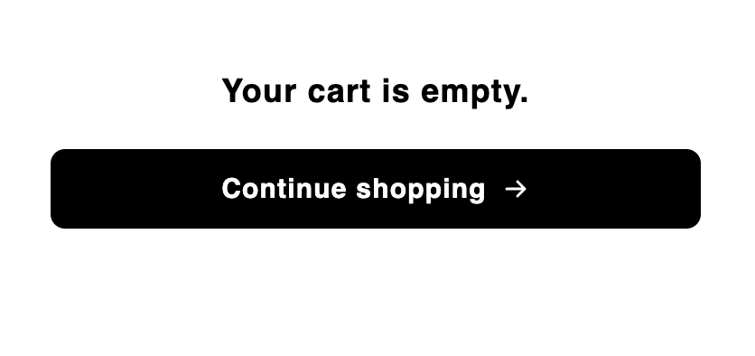
> The **Empty cart** block is the content shown when the cart has no items, typically a message and a continue-shopping button, so an empty drawer is still useful and on-brand. It only appears in the cart's **empty state**; other blocks (such as Header) can sit alongside it in that same state.
 ## Behavior
* The block appears only when the cart is empty. As soon as a shopper adds an item, the cart switches to its filled state and this block is replaced by your filled-cart layout.
* In the editor, the CTA link is inert so clicking it doesn't navigate you away while designing.
## Settings
| Setting | What it controls | Default |
| -------------------- | ---------------------------------------------------------------------------------------------------------------------------------------------------------- | --------------------- |
| **Empty cart text** | The empty-state message. Rich text. | `Your cart is empty.` |
| **Button text** | The button label. Supports inline HTML formatting. | `Continue shopping` |
| **Button link** | Where the button links. | `/collections/all` |
| **Background color** | Background colour for the block. Blank leaves it transparent, so the cart's own background shows through. | `transparent` |
| **Alignment** | How the block's text and button are aligned — **Left** or **Center**. | Center |
| **Fit to height** | Whether the block fills the cart body's remaining height and centres vertically, or sits at content height — **Fill remaining height** or **Fit content**. | Fill remaining height |
## Placement and limits
* **Region:** body.
* **Maximum:** 1 per cart state.
* **State:** empty cart only. This block does not appear in the filled state. New carts also include a Header in the empty state by default; see [How do carts work?](/aftersell/cart/how-carts-work).
* Added to new carts by default. Not locked — you can remove or hide it.
## Custom template
Supports a [custom template](/aftersell/cart/custom-templates) from its Code tab, which replaces this block's built-in markup with your JSX. These are the props it receives.
| Prop | Type | What it's for |
| --------- | -------- | -------------------------------------------------------------------------------- |
| `text` | `string` | The empty-cart message as sanitized HTML. |
| `cta` | `string` | Call-to-action button label, as plain text. |
| `ctaHtml` | `string` | Call-to-action button label as sanitized HTML — what the default markup renders. |
| `href` | `string` | Where the call-to-action points. |
This block only renders when the cart is empty, so there's no cart object in the props. Render `href` as a real `` rather than a scripted navigation, and `text` with `dangerouslySetInnerHTML`, since it's already sanitized HTML.
## Design
Style this block with its **Design** section in the settings panel. These are per-block overrides that layer on top of your global design and fall back to it when blank.
### Text
The **Text** section in Design lets you control the typography of two elements. Use the **Text element** picker to switch between them.
**Message** — the empty-state message text. Bold and text color are set in the Rich Text Editor above (in the Settings tab), not here.
| Setting | What it controls | Default |
| ------------------ | ---------------------------- | ------------------- |
| **Font** | Font family for the message. | Inherits from theme |
| **Size** | Font size. | `18px` |
| **Line height** | Line height multiplier. | `1.3` |
| **Letter spacing** | Tracking between characters. | Normal |
**Button label** — the text on the continue-shopping button. Text color is set in the Button section of Design.
| Setting | What it controls | Default |
| ------------------ | -------------------------------------------------------- | -------------- |
| **Size** | Font size. | `15px` |
| **Weight** | Font weight — Light, Regular, Medium, Semibold, or Bold. | Semibold (600) |
| **Line height** | Line height multiplier. | `1.47` |
| **Letter spacing** | Tracking between characters. | Normal |
### Button
The **Button** section lets you style the CTA button independently from the global button design. Use the **Default / Hover** toggle to switch between the two states.
| Setting | State | What it controls |
| -------------------- | ------- | --------------------------------------------------------------------------------------- |
| **Background color** | Default | Button fill in its resting state. Falls back to the global button background color. |
| **Text color** | Default | Button label color in its resting state. Falls back to the global button text color. |
| **Background color** | Hover | Button fill when a customer hovers over it. Falls back to the default background color. |
| **Text color** | Hover | Button label color on hover. Falls back to the default text color. |
| **Border color** | — | Button border color (both states). Falls back to the global button border color. |
| **Border radius** | — | Corner rounding for the button. Falls back to the global button border radius. |
What are design settings? Learn more here: [Design settings](/aftersell/cart/design-settings).
## Behavior
* The block appears only when the cart is empty. As soon as a shopper adds an item, the cart switches to its filled state and this block is replaced by your filled-cart layout.
* In the editor, the CTA link is inert so clicking it doesn't navigate you away while designing.
## Settings
| Setting | What it controls | Default |
| -------------------- | ---------------------------------------------------------------------------------------------------------------------------------------------------------- | --------------------- |
| **Empty cart text** | The empty-state message. Rich text. | `Your cart is empty.` |
| **Button text** | The button label. Supports inline HTML formatting. | `Continue shopping` |
| **Button link** | Where the button links. | `/collections/all` |
| **Background color** | Background colour for the block. Blank leaves it transparent, so the cart's own background shows through. | `transparent` |
| **Alignment** | How the block's text and button are aligned — **Left** or **Center**. | Center |
| **Fit to height** | Whether the block fills the cart body's remaining height and centres vertically, or sits at content height — **Fill remaining height** or **Fit content**. | Fill remaining height |
## Placement and limits
* **Region:** body.
* **Maximum:** 1 per cart state.
* **State:** empty cart only. This block does not appear in the filled state. New carts also include a Header in the empty state by default; see [How do carts work?](/aftersell/cart/how-carts-work).
* Added to new carts by default. Not locked — you can remove or hide it.
## Custom template
Supports a [custom template](/aftersell/cart/custom-templates) from its Code tab, which replaces this block's built-in markup with your JSX. These are the props it receives.
| Prop | Type | What it's for |
| --------- | -------- | -------------------------------------------------------------------------------- |
| `text` | `string` | The empty-cart message as sanitized HTML. |
| `cta` | `string` | Call-to-action button label, as plain text. |
| `ctaHtml` | `string` | Call-to-action button label as sanitized HTML — what the default markup renders. |
| `href` | `string` | Where the call-to-action points. |
This block only renders when the cart is empty, so there's no cart object in the props. Render `href` as a real `` rather than a scripted navigation, and `text` with `dangerouslySetInnerHTML`, since it's already sanitized HTML.
## Design
Style this block with its **Design** section in the settings panel. These are per-block overrides that layer on top of your global design and fall back to it when blank.
### Text
The **Text** section in Design lets you control the typography of two elements. Use the **Text element** picker to switch between them.
**Message** — the empty-state message text. Bold and text color are set in the Rich Text Editor above (in the Settings tab), not here.
| Setting | What it controls | Default |
| ------------------ | ---------------------------- | ------------------- |
| **Font** | Font family for the message. | Inherits from theme |
| **Size** | Font size. | `18px` |
| **Line height** | Line height multiplier. | `1.3` |
| **Letter spacing** | Tracking between characters. | Normal |
**Button label** — the text on the continue-shopping button. Text color is set in the Button section of Design.
| Setting | What it controls | Default |
| ------------------ | -------------------------------------------------------- | -------------- |
| **Size** | Font size. | `15px` |
| **Weight** | Font weight — Light, Regular, Medium, Semibold, or Bold. | Semibold (600) |
| **Line height** | Line height multiplier. | `1.47` |
| **Letter spacing** | Tracking between characters. | Normal |
### Button
The **Button** section lets you style the CTA button independently from the global button design. Use the **Default / Hover** toggle to switch between the two states.
| Setting | State | What it controls |
| -------------------- | ------- | --------------------------------------------------------------------------------------- |
| **Background color** | Default | Button fill in its resting state. Falls back to the global button background color. |
| **Text color** | Default | Button label color in its resting state. Falls back to the global button text color. |
| **Background color** | Hover | Button fill when a customer hovers over it. Falls back to the default background color. |
| **Text color** | Hover | Button label color on hover. Falls back to the default text color. |
| **Border color** | — | Button border color (both states). Falls back to the global button border color. |
| **Border radius** | — | Corner rounding for the button. Falls back to the global button border radius. |
What are design settings? Learn more here: [Design settings](/aftersell/cart/design-settings).